Vis Lang , Wk 2 Assignment: Signs
Signs, can be terrible. Much like that film by M. Night Shyamalan (that alien, I mean, c’mon).
I live in Greenpoint, which has a wealth of mom-and-pop businesses and thus a goldmine of bad (though perhaps well-intentioned) visuals. Here are a few I saw on a morning stroll this weekend:
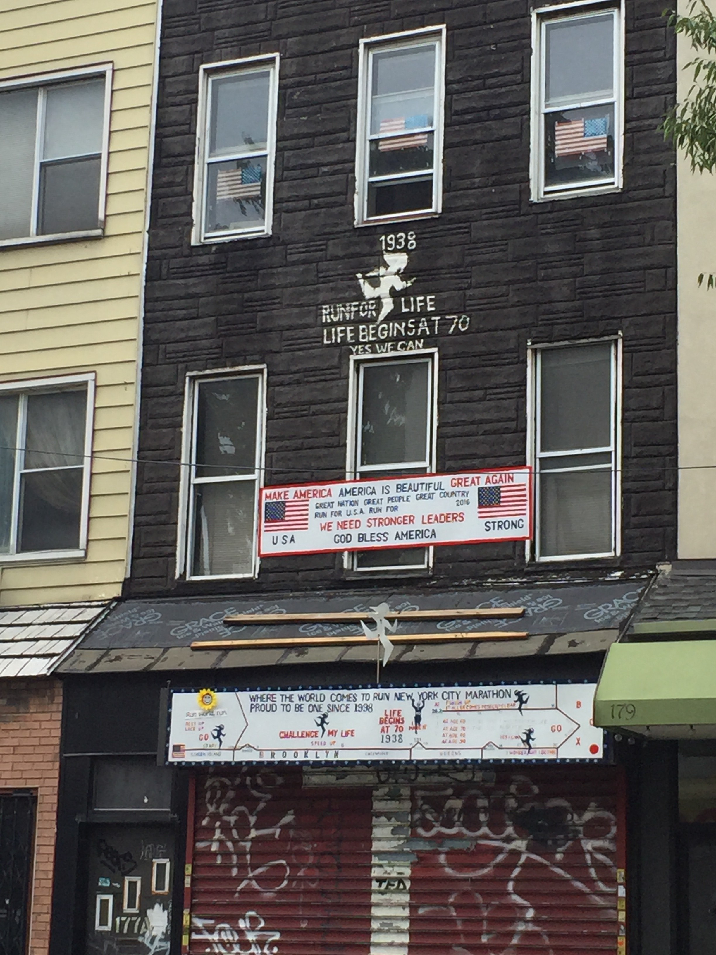
Still not sure what’s going on here, but I think someone ran a marathon? Go them!
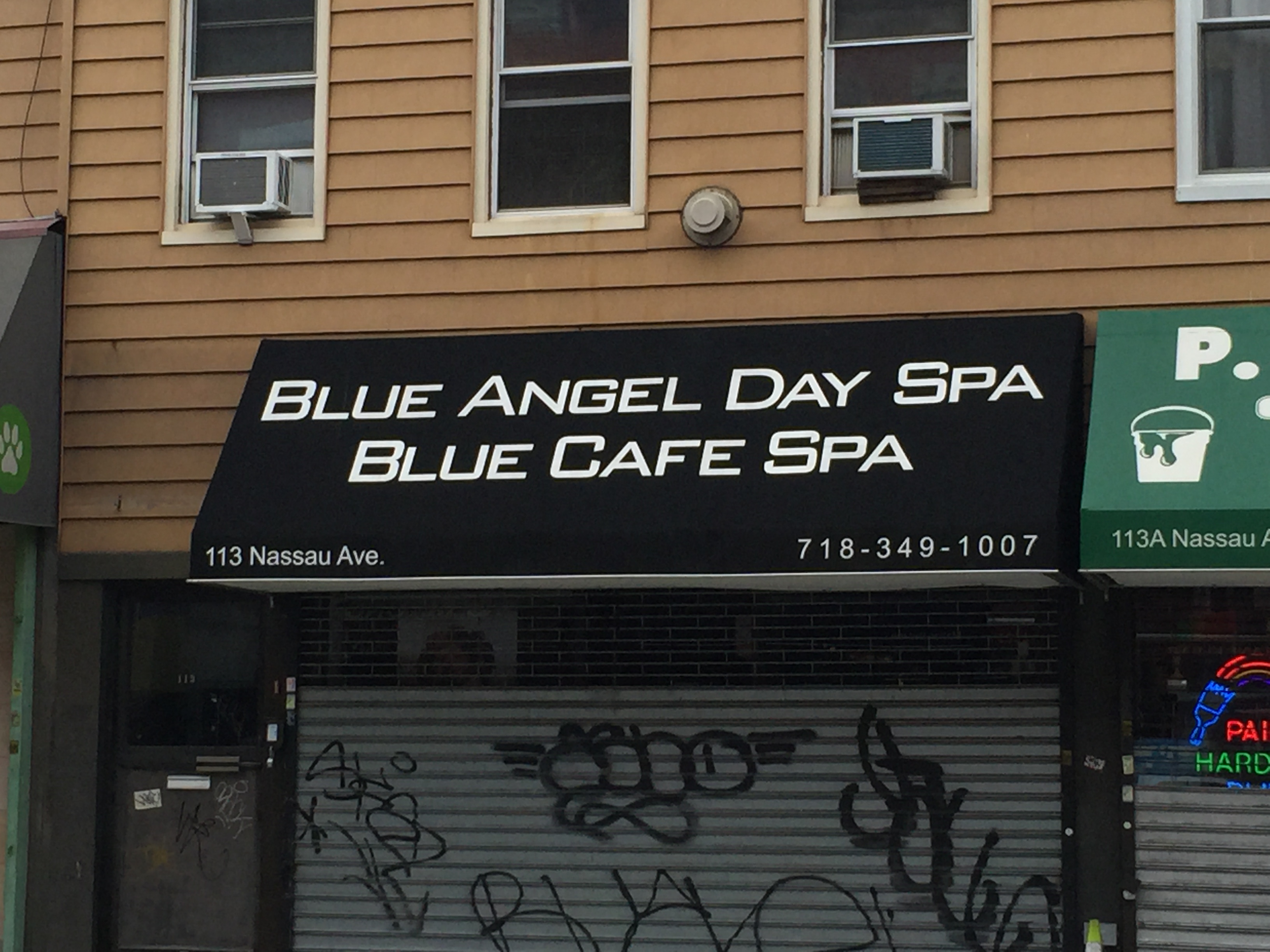
So which spa is it? Do I get a two-for-one deal?
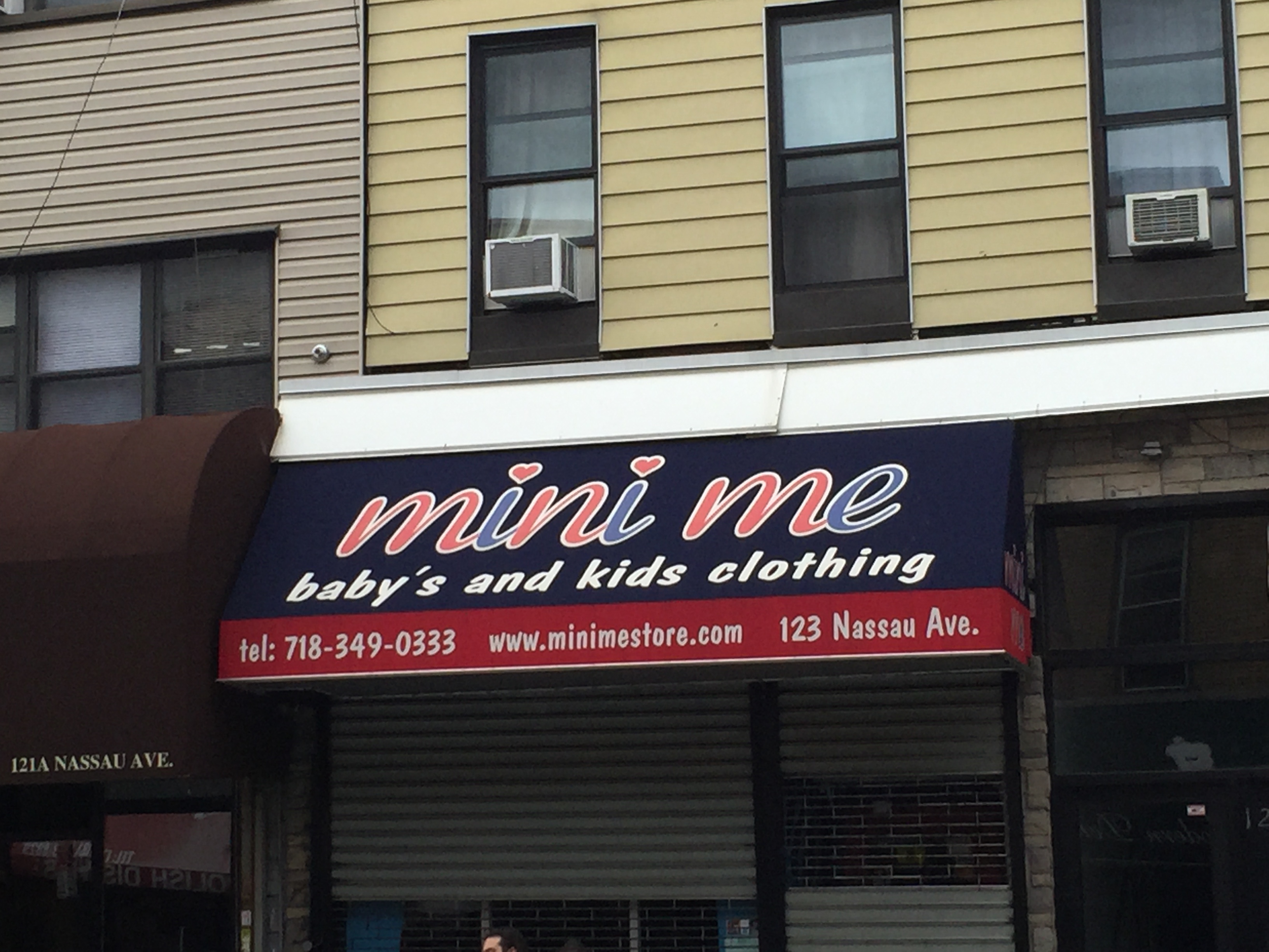
So only shop here if you have one baby, but multiple kids
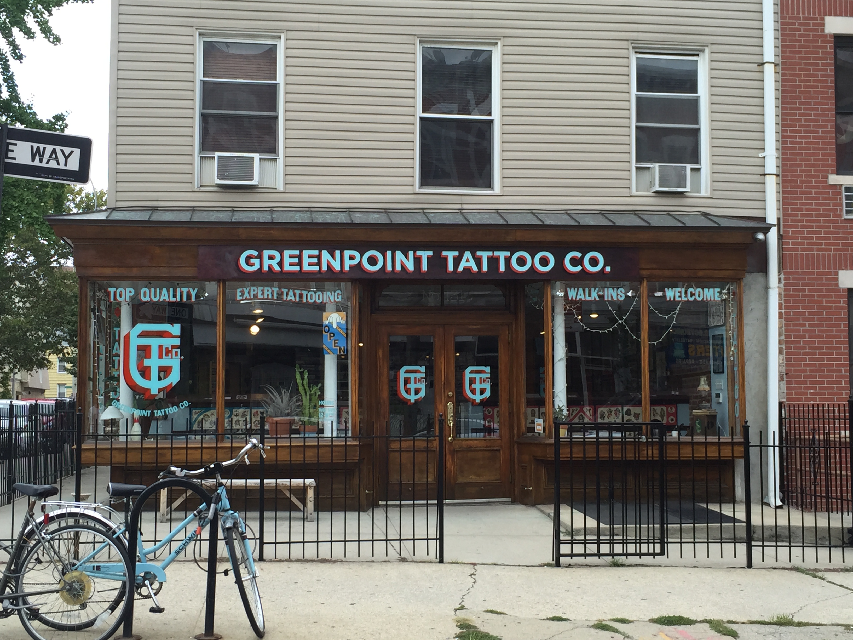
There are, however, some really nice ones as well, such as this hand-painted lettering at Greenpoint Tattoos:
Originally I was going to write about and alter one of the above signs, but then the funniest thing happened. I was at Penn Station, returning from a family dinner in New Jersey. I’d already managed to get lost looking for my outbound train (and then read the slate article about the terrible signage in Penn Station during the ride and lol’d to myself quietly).
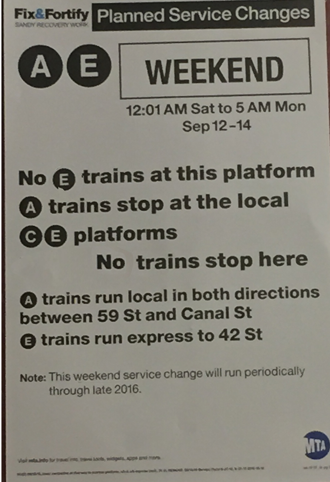
When I was coming back into the city, I realized I would finally have to deal with one of those things I’ve dreaded since moving to New York – weekend rail service changes. I go to swipe my card at the uptown E track, but there’s a sign that says the train isn’t running there. It’s running on the express line. Um. Ok. Would be helpful if you told me which line is the express line. But I figure out it’s the A, so I go to that track and I see this sign:
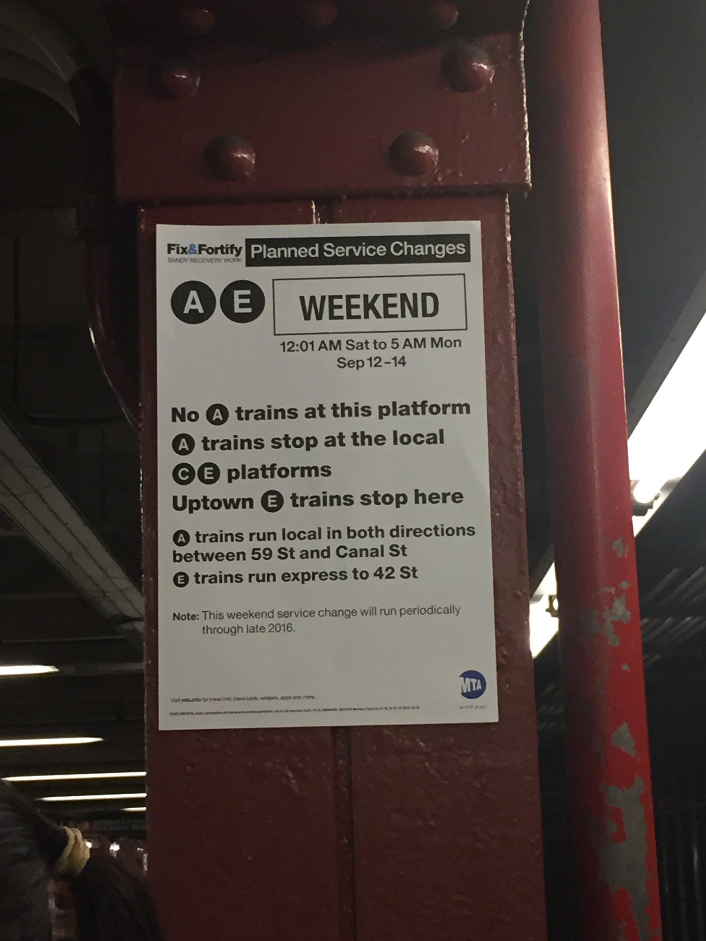
Great! This sign tells me I’m in the right place. I’m going to get home alright. But lawd, is it not a terribly written, wordy confusing sign. So I snap a picture of it in good fun (and to post here) and continue waiting for the train.
That’s when I notice that everyone on the platform starts sprinting for the stairs…because the E train has pulled up to another platform. ZOINKS! Gotcha! Damn, MTA. What’s the point of making a sign that says where a train is going to stop if its not going to stop there? And then do that TWO times over? oof.
Luckily, I caught the train. And had proof of another terrible sign.
Heres the improved sign:
I think it does a better job of telling you where you need to be, or at least, where you DON’T need to be…