Vis Lang, Wk 1 Assignment: Design Analysis
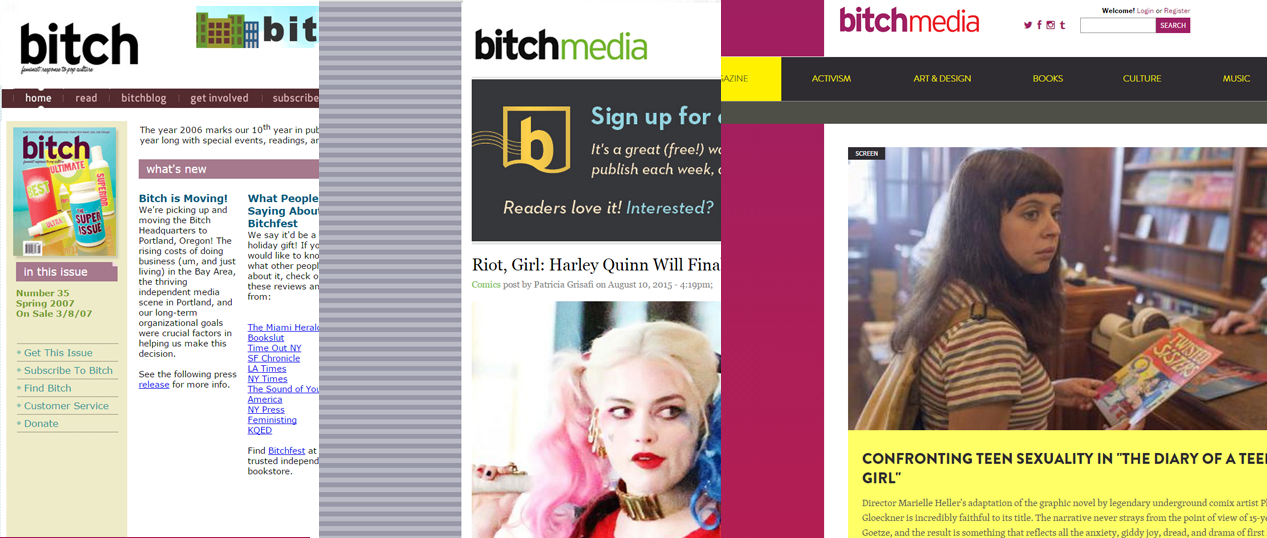
While I was trying to think of what piece to analyze for my assignment this week, I happened to click on the Bitch Media website and…they’d re-designed it. Seems to be something a few of my favorite lady sites have gone through the past couple months – Hairpin and Rookie also recently did re-designs.
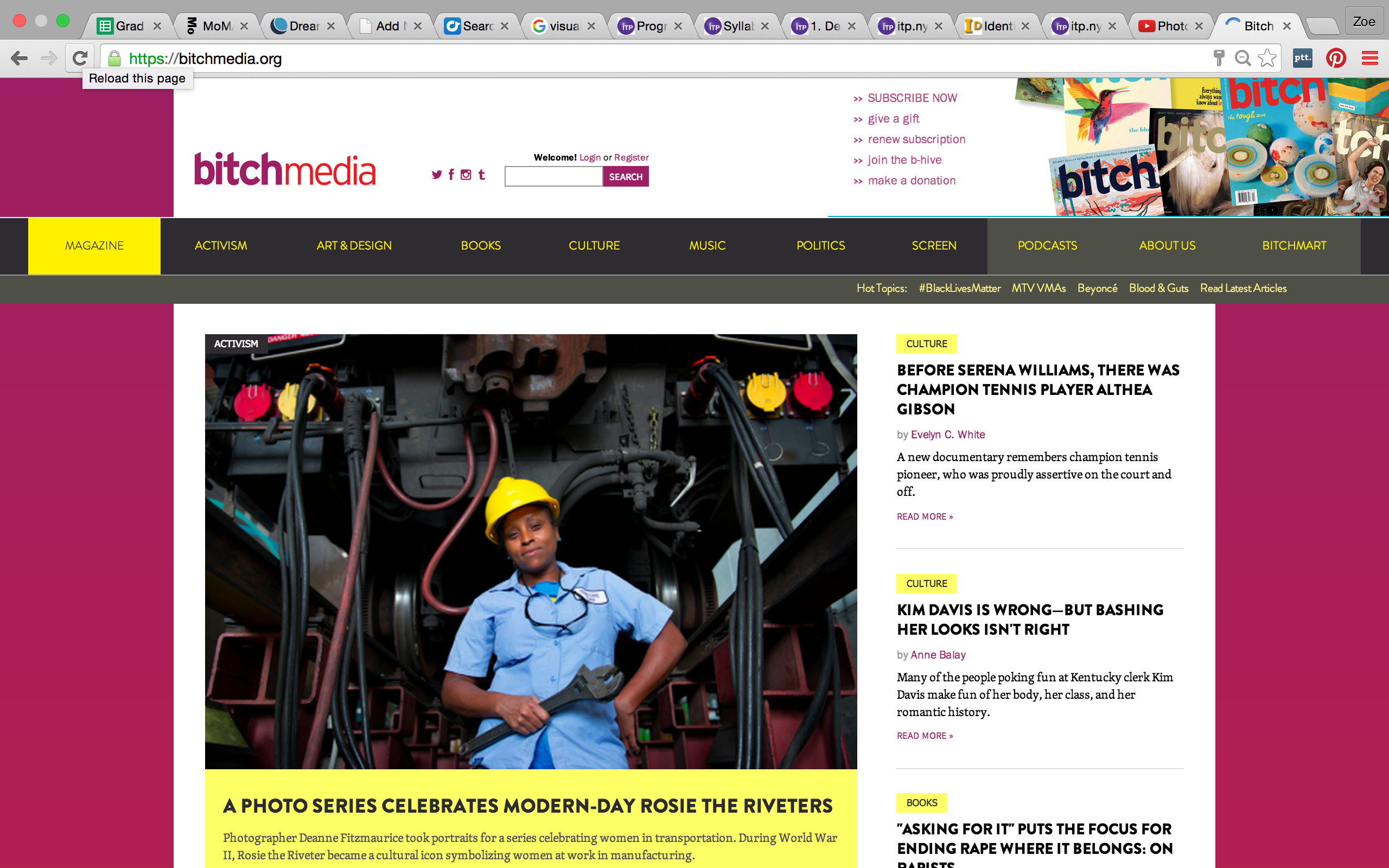
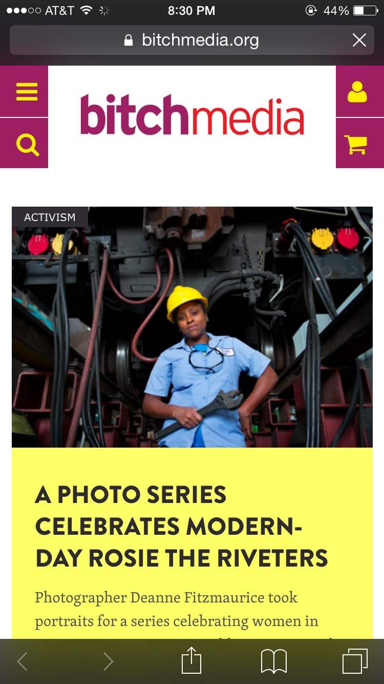
The brand-spankin-new website
So, I thought – why not analyze that?
Obviously, there’s a reason as to why the Bitch Media team decided to redesigned the site. As we talked about in class, design is a form of organization and a means of realizing the ideal version of an object, or in this case, a website. Bitch Media’s website has gone through several iterations since it first appeared on the web in 1998.
Originally conceived of as simply an online companion to it’s more well-known print publication, Bitch Magazine, Bitch Media’s website has evolved in its own right into a central source for feminist writing and debate. As more people become introduced to their content through its online presence, it’s important that the website should be as accessible as their print publication.
In the words of Bitch Media’s Art Director, Kristin Rodgers Brown:
“Someone recently told me that the thing they love about the design of Bitch magazine is that it makes complex content easy to digest and fun to read. All through this site redesign—as we were grappling with never-ending questions about structure, design, and function—I had that comment running through my head. The result? We made it simple and FUN to look around the site.”(1)
So how does the redesign maximize readability and content organization?
Let’s take a look at the different visual aspects of the new website:
Underlying System
The website uses somewhat of a grid system, organize around a central bisecting line, while creating smaller columns to the left and right. It uses clever breaks in the grid lines to bring your eye to important information, such as the main story. There’s a large amount of negative space on either side of the content, making it easy for your eyes to focus on the meat of the website.
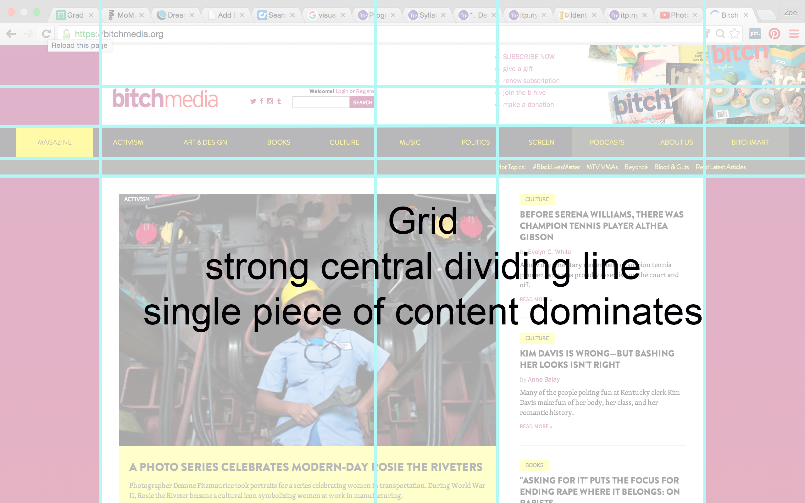
In terms of hierarchy, the way my eye moves across the page (and I’ll be honest, I’m not entirely sure how correct this is, but this was my gut reaction) it goes from:
– Main header across top, which includes the logo, social media platforms, and a list of ways to get involved. Those bright colors in the Bitch Media logo pop!
– Secondary header includes topics that are used to organize content, a small sub-header includes trending “Hot Topics”
– Then the eye drops down to the large main story in the body of the page, which takes up most of the top-fold of the site
– Moves across to the side bar with other stories and content. This also lines up with the #hottopics sub-header.
(FYI: The site uses the over-the-fold technique – have to scroll to see more content. But I’m just focusing on what you see when you first load the page.)

Typography
From what I could identify using What the Font? and identifying the source code, it looks like the following are the fonts used in the website:
brandon-grotesque – That’s the black, bold font they use for headlines
skolar – Looks like this is the yellow font used in the topics and links
Georgia – For the written content
(there’s some other fonts listed in the source code, but my assumption was that the ones that are listed after the first are what the website defaults to if the page doesn’t load the intended one…si?)
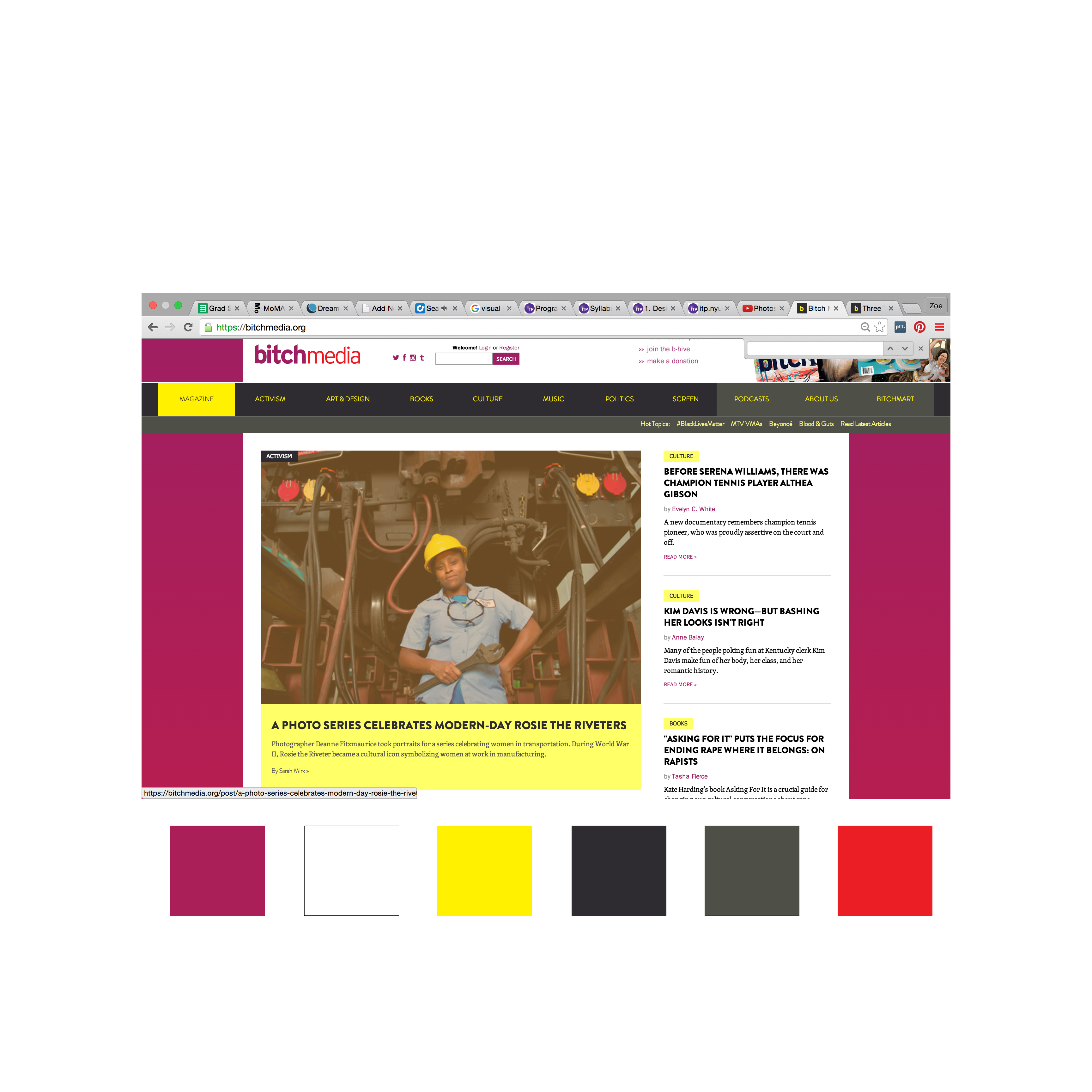
Color Palette
Bright, warm, saturated colors – magenta, white, yellow, black/dark grey, light grey, red
Anaylsis
To return to the words of the Art Director, is the site simple and fun? Does it make everything readable?
In terms of simplicity, sure – you see content right away. The big chunk of space that the main story takes up immediately tells you what is most interesting and important. This structural change is in DIRECT contrast to the previous way they organized their site, which was in more of a blog/chronological format, where there was no hierarchy to the posts. Now important articles stay at the top of the page longer and it is easier to distinguish between highly-researched, long-format pieces from daily news responses (relegated to the side bar and below-the-fold) (2).
I took a look at the mobile platform as well, since they explicitly wrote that their intention with the redesign was to improve readability across devices. The mobile platform preserves the content hierarchy, hitting you with the logo and immediately the main story, followed by recently posted articles that on the desktop browser are on the side. Again, that focus on immediately showing you the most important content.
As a reader, I find it interesting that they now prioritize certain content over others and wonder, what system do they use to choose their main story? Why are certain stories considered “more important”? Will other articles that don’t fit that criteria simply get overlooked?
I do think highlighting content topics at the top of the page brings increased accessibility to the content, particularly the “Hot Topics” sub-header. It makes me as a reader immediately want to delve into subjects that I’m interested in and explore those I’d want to know more about. I think it does more to encourage the reading of particular articles, ones that I may have skipped past in the previous website if they hadn’t been visually recommended.
I also want to point out that they have increased the visibility of ways to get involved, by placing links in the header directly across from the logo. This design choice makes it more obvious for readers to engage with the Bitch Media community. As a media company that prides itself on community involvement and depends on submissions and donations, I think its a good step to visually prioritize audience engagement.
Is it fun? The colors are playful – bright, candy-like. The fonts have an edginess, boldness, and being in all-caps of the headlines lends a certain forcefulness to the words. This is not a flowery, simpering, weak website. As a comparison, the website Rookie, who also recently did a redesign, uses youthful visual tropes of hand-writing and doodles, which gives it a whimsical, high-school youth effect. Bitch Media’s website feels like the stronger, more-experienced older sister. One that doesn’t have time for frou-frou backgrounds and manages to keep its content clear and concise while still being bright, young, and punchy.
Overall, the website’s redesign has improved its accessibility to radical, informative content while maintaining a bold, dynamic aesthetic. As a reader, you immediately know the most important piece of content while also having easy access to other articles and topics, as well as easy ways to get involved in the company. The bright colors and edgy fonts (in all caps) engage the eye while keeping things playful, yet strong. In comparison to the previous iteration of the website, I think the Bitch Media team has done a successful job in better organizing and improving upon the way they deliver content and engage their audience. Brava, ladies.
Notes:
1.https://bitchmedia.org/article/three-things-i-love-about-our-new-website-design
2.https://bitchmedia.org/article/introducing-new-bitchmediaorg