PComp, Wk 2: Labs – Electricity and Switches
LABS
1. Electricity
So at first I just wasn’t putting things in the right place. Kinda funny looking back on how I had the circuit set up.

I was working with KC and Katie helped us with the part where the LED positive had to be in the same row as the resistor. However, it still wasn’t lighting up.

What we learned is that I needed to shove things in my breadboard. Hard. I had my circuit set up correctly several times over, but it took a little pushin and shovin to get the light to turn on. I was so worried about breaking delicate wires that I wasn’t actually connecting anything! But once I got everything firmly into the board, VOilA! LET THERE BE LED LIGHT!

Then I put in a second one (in parallel) and they look like they’re dancing.

I then used the amperage to complete the circuit.
2. Switches
Once I was able to get the LEDs to light up, setting up my first switch was a piece of cake.
But when I added a second according to the online pictures, couldn’t figure out why it wasn’t working until Paula asked if you pushed both buttons at the same time. Hadn’t tried that (I was pushing them in random combinations), so I did and it worked!
ICM, Wk 2: Jazzy Timez Animation
When I was trying to come up with a piece for this week I had an image in mind of these node-like shapes appearing with the press of the button. Sort of circles, with spindly lines coming out of them. The shapes would grow and the lines would lengthen outward as the mouse was pressed.
So, I figured that a good place to start my drawing with would be some circular shapes. I knew that I wanted them to appear where my cursor was and when I clicked my mouse.
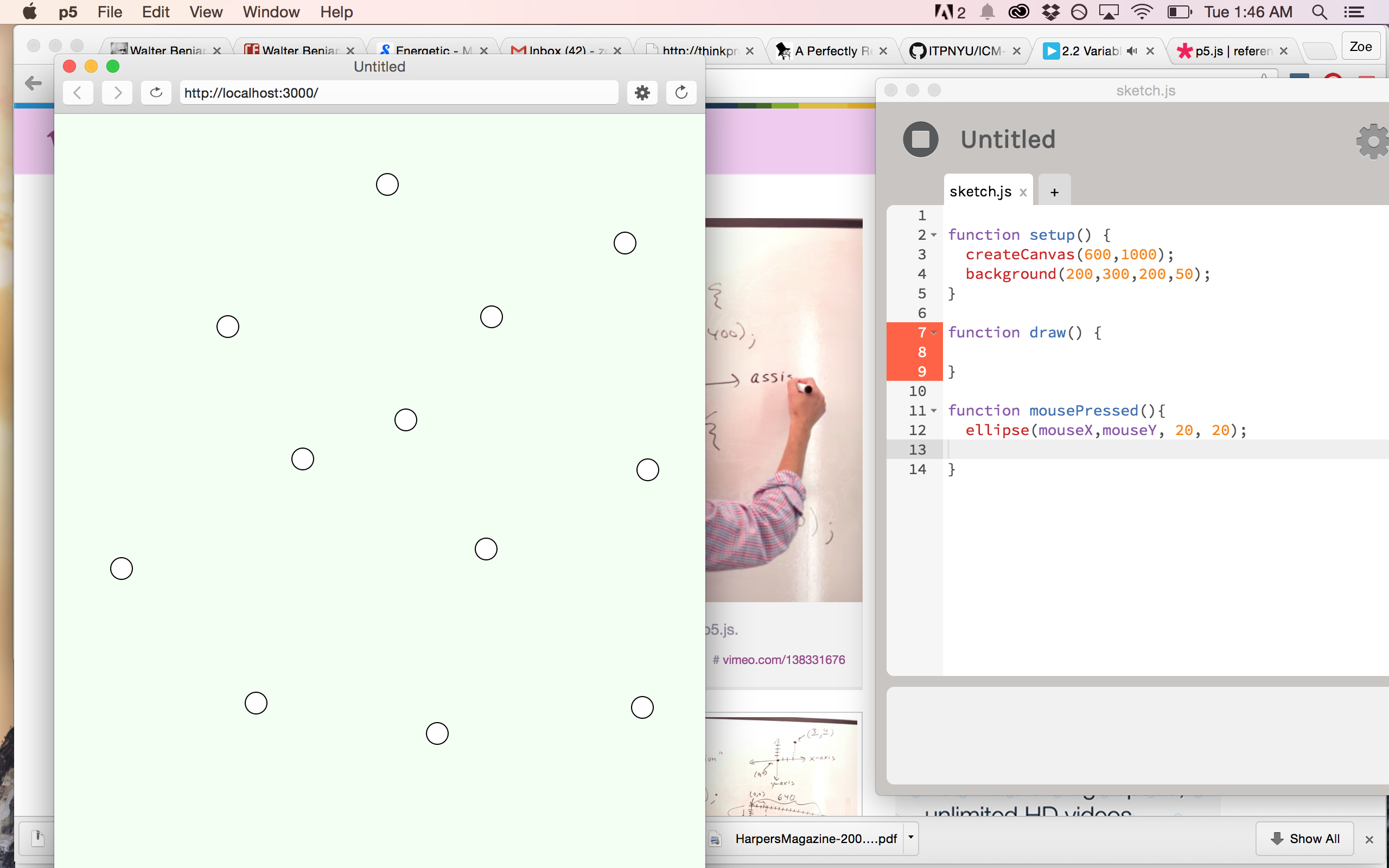
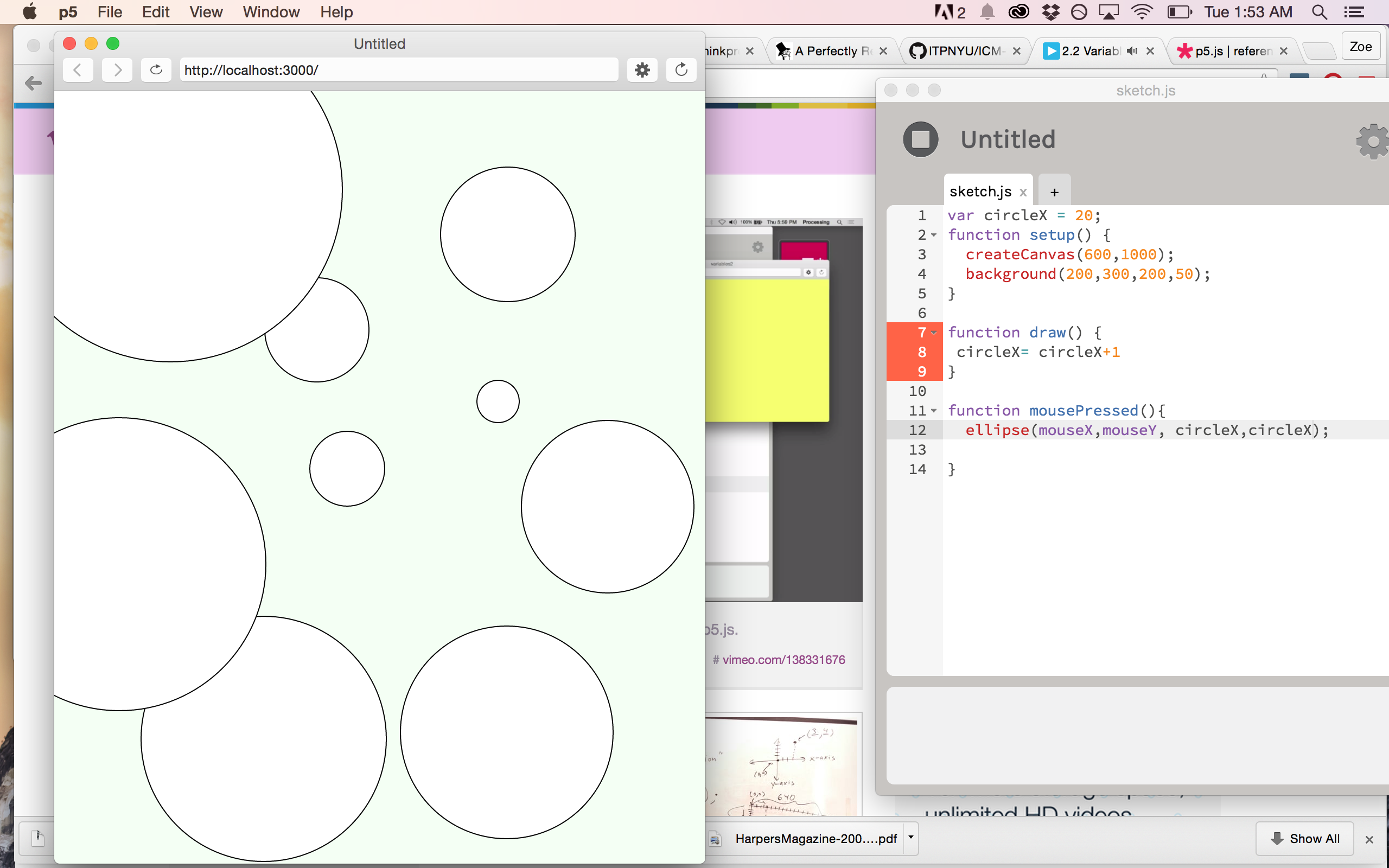
I decided I should try and figure out how to play around with the size of these circles and randomizing it each time I clicked the mouse. Tuned into a couple of Shiffman’s handy-dandy vids and found the one on randomizing. Eh, Voila! Circles of various shapes and then sizes!

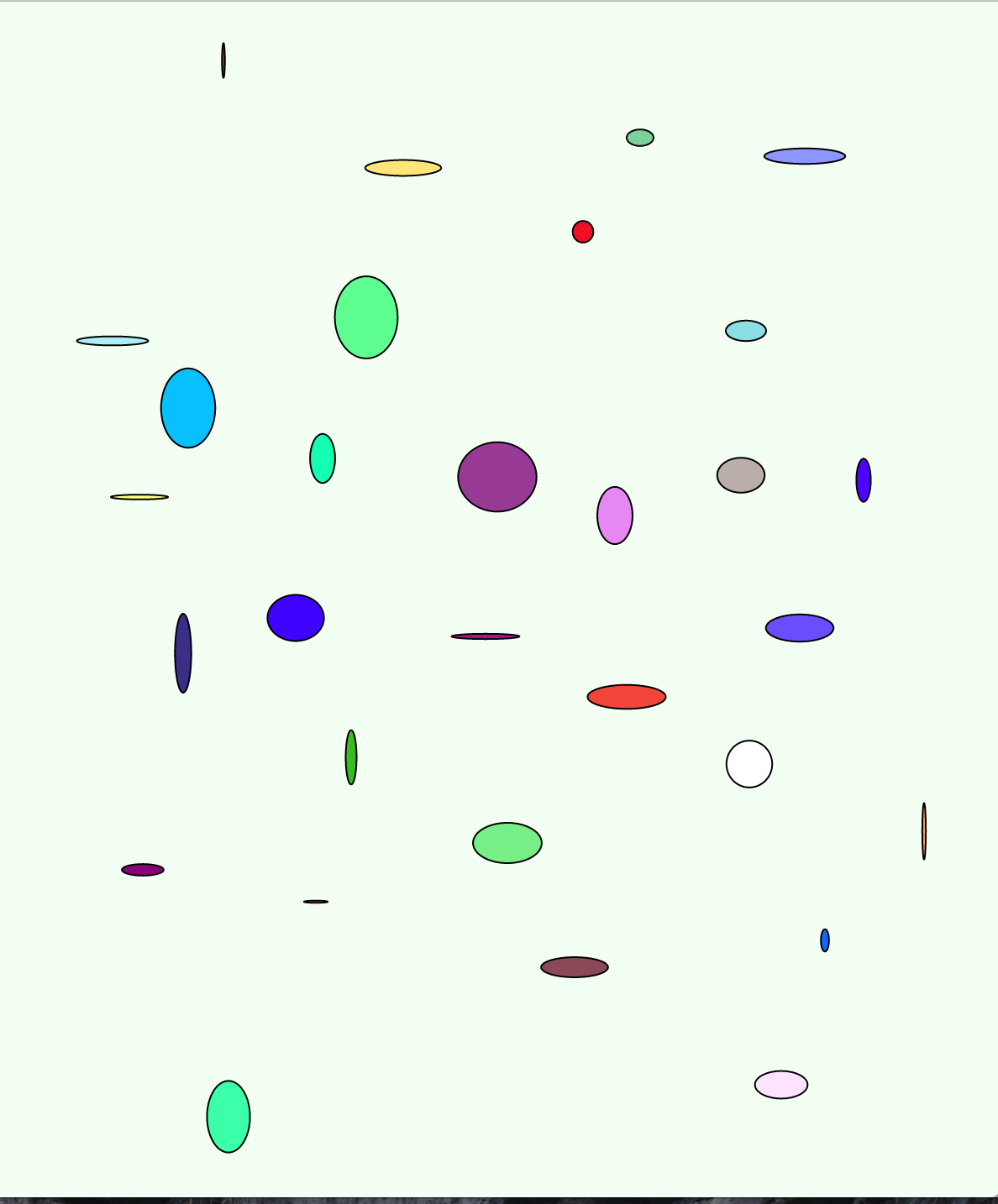
Then, I decided that rather than make another black and white sketch, that I’d try playing around in color because THAT’S NEW! So I happily clicked around and made a bunch of multi-colored circles.
Now, here’s where things got tricky/interesting/I just tried out a bunch of code.
What I wanted to have happen is that when my I released the mouse, my circle that I just created would move off in a random direction. I realized I needed to somehow get a moveX function in there while maintaining my mouse x (since I still wanted shapes to pop up where my cursor was). [I played with moveX = moveX +1. I tried function mouseReleased().] This led me to looking a bit into conditional statements, and I tried juxtaposing a mousePressed() command with one that asked the circles to move.
I played around with a couple iterations, adjusting code here and there.
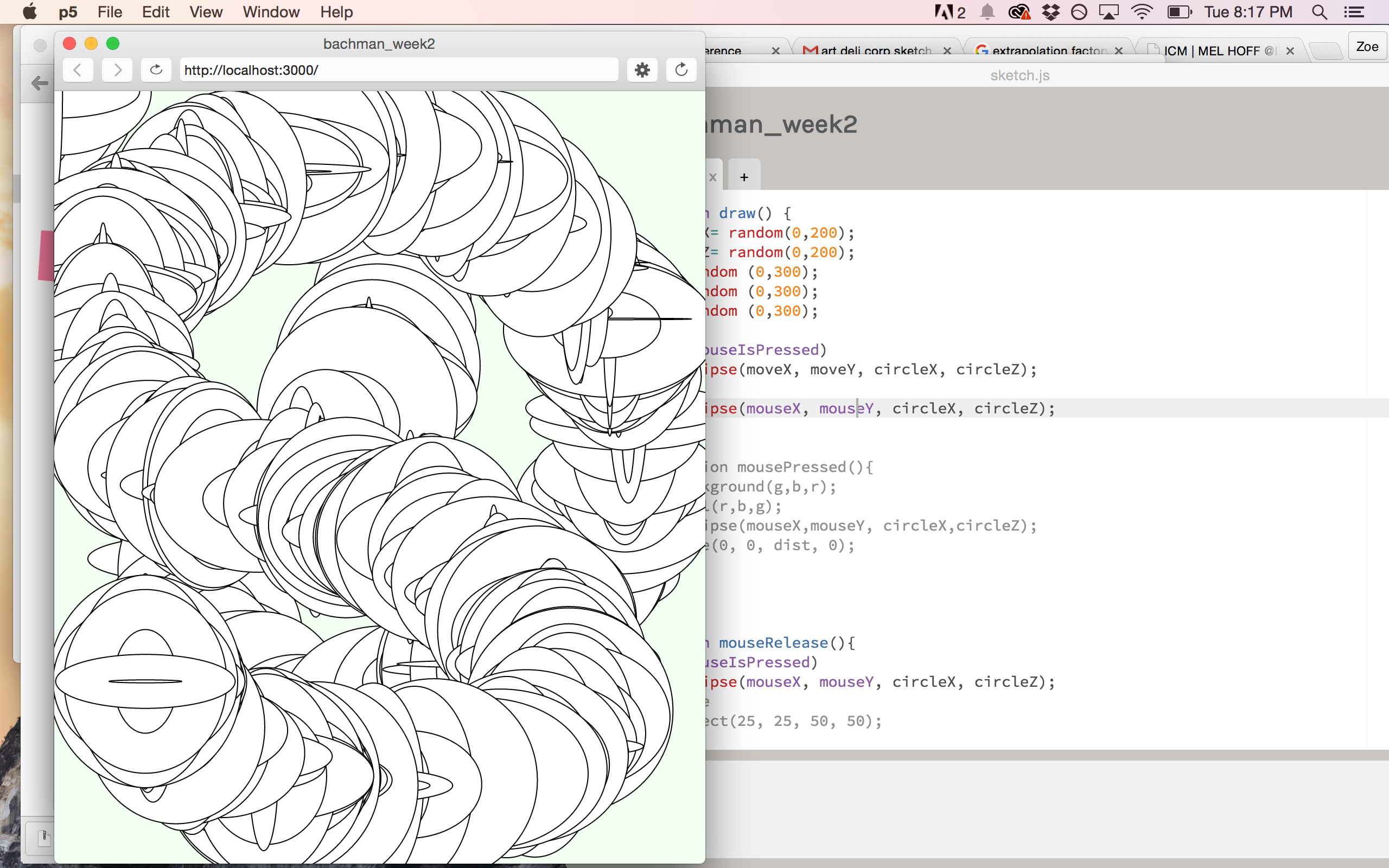
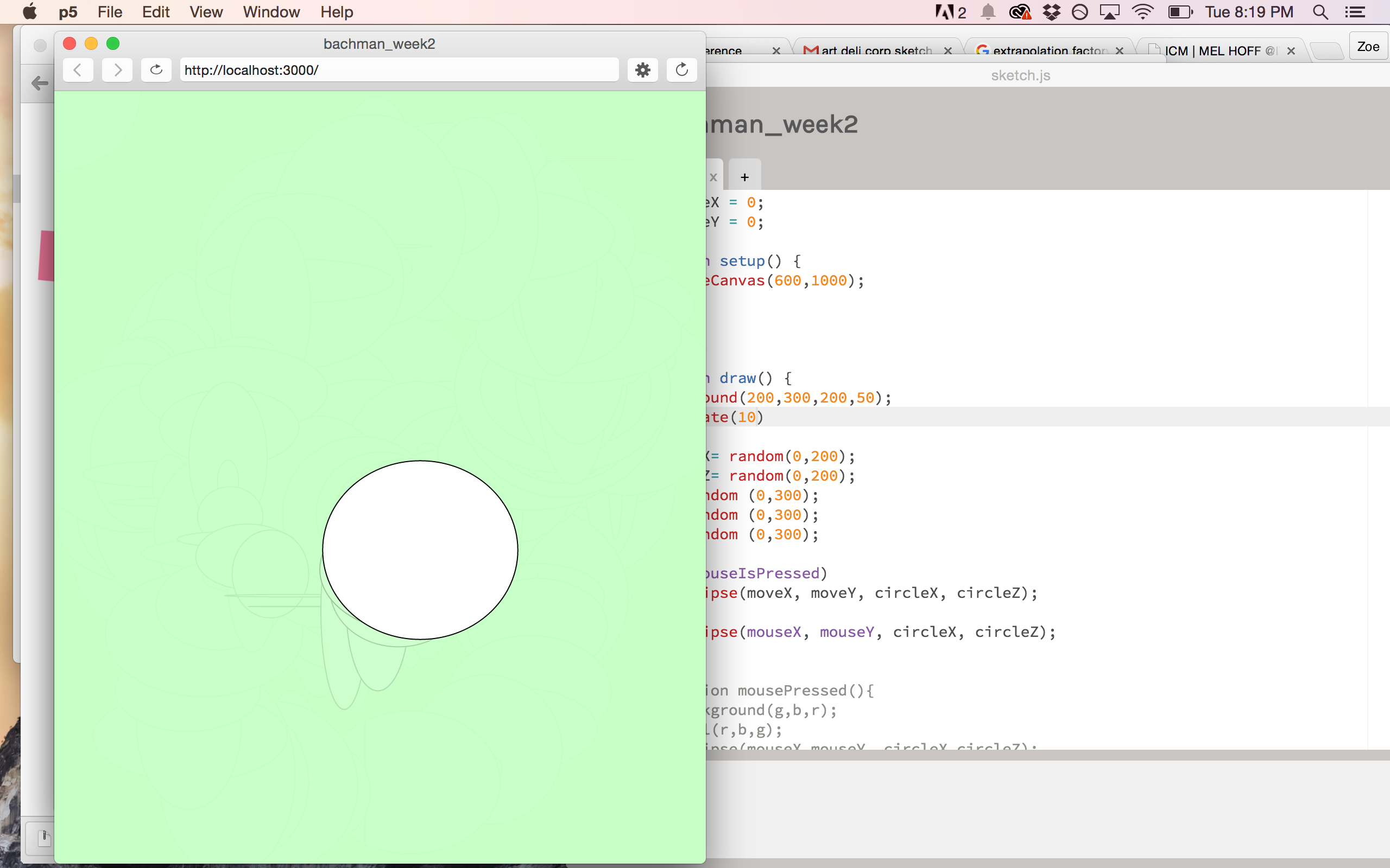
So when I got to this point, my sketch reminded me of animations from the 60s – bright, solid geometric shapes bouncing around the screen. Maybe something I saw in Fantasia? So I decided to add some rectangles…but also look into adding a jazzy audio file to give it a real beat era vibe.
When I looked at the p5.js reference on audio, I honestly didn’t find it to be helpful at all. (Though thinking about it in retrospect, I maybe should have checked out the sound entry…). In any case, I did a quick web search and found this tutorial here: http://coursescript.com/notes/interactivecomputing/sound/
I tested it out with a free song I found online, made a few mistakes and fixed them and then….I had sound!
But as I listened to it, I realized that it wasn’t the song I wanted. I had this very particular jazz melody stuck in my head. Problem was, I had no idea who played it. So I thought back to the jazz albums I’ve owned and went with my first guess: Miles Davis. I clicked on the first YouTube video of his that I saw and, Voila ! I was correct!
But when I added the .mp3 (and maybe I didn’t realize it before because the other one didn’t have speech) but I realized that (duh) every time I clicked the mouse to get the shapes and colors to change, the track started over. Hm. I tried putting the sound.play(); command in different parts of the code – in a separate mousePressed function before and after the other, in the set up, in the draw function – but either it wouldn’t allow the rest of the animation to work (I guess because it took too long to load?) or, it wouldn’t play at all, or it would loop it over the previous iteration.
Then I realized I need to assign another command, one that I would only need to issue once. I remembered someone mentioning something about a keyPressed() function, so I tried it out and HECK YEAH! Now I can click and make lots of circles of different shapes and colors to the sweet music of Miles.
EXCEPT, apparently, not in the browser. I go back to the tutorial and it says some browsers don’t support .mp3 because its codec (?) patented. So I tried adding in a .ogg function.
Alas, that didn’t work either. So, I’m moving on for the moment so I can get this blog post up. [EDIT: IT’T WORKS! Thanks, Shiffman!]
So here’s my animation that should play Miles Davis’ classic, So What:
http://www.zoebachman.net/itp/ICM/bachman_week2.b/
I tried to find some corresponding example of a 1960s animation, and did come across this Oscar winning short – The Critic (1963), narrated by none other than Mel Brooks. I certainly see some similarities, though I really wanted one that used jazz.
https://www.youtube.com/watch?v=KnIQhU_GMf0
Or this classic by Chuck Close, The Dot and the Line: A Romance in Lower Mathematics (1965):
https://www.youtube.com/watch?v=OmSbdvzbOzY
I do still hope to make my black spindly animation at some point! Funny though, how I went from this very delicate, dark concept to a bright, geometric animation. La.
Some questions I had were, how can I make the rectangles a different randomized color from my circles, as in can I assign a fill function to a particular set of shapes? Also, how can I get shapes to move after my mouse is released?
Sound and Vid, Wk 1: Response to Readings
plagiarism, appropriation, lifting, copying, stealing, riffing, capturing… la dee da.
Tbh, I’m slightly overwhelmed by all the things I want to say about the readings/videos we had to watch this week. I got a little into the idea of copying/replication in my ICM Wk 1 HW , so I was immediately intrigued by our selection of readings. So as a disclaimer, I’m not sure I’m going to get to everything that I want to say in here (nor say it as eloquently as I would like), but, I’ll try my darndest. So, outlined below are some of my major thoughts regarding the material:
1. Walter Benjamin and Art’s Aura
Much of the discussion surrounding copyright is predicated on this notion (and assumption, really) of art having this special position in our (western) society. Lethem argues that art exists as both something inalienable yet still able to be commodified. Of course, couldn’t help but think of Walter Benjamin’s essay, ‘The Work of Art in the Age of Mechanical Reproduction,’ which I haven’t read in several years but do recall that it had a lot to do the belief that art has a certain aura that imbues it with mystical properties and revered status. I think a lot of notions about the need to “protect” certain artistic pieces from pirating, remixing and the like comes from this notion of art as a supernatural creation. People find accusations of plagiarism troubling because it puts into question philosophical notions of artistic integrity and the “creative genius.” What’s interesting to me is the specific historical, political, cultural context that copyright infringement really became an issue AKA rise and maturation of capitalism. As mentioned in Drew Christie’s “Allergy to Originality” piece, originality didn’t become a concept until the late 18th century. As art became seen increasingly as a commodity and a signifier of prestige (cue: Bourdieu’s concept of Cultural Capital) and we just became obsessed with generating profit from anything that we could, of course people are going to eke out as much money as they can from an object or event. So while Disney gorged himself on classic fairy tales, those iterations are for that corporation’s profit and their’s alone.
Still, worth mentioning that traditionally in other societies around the world, art did not occupy such a prestigious position. There’s some very interesting reading out there regarding intellectual property rights and commodification of Australian Aboriginal art, an art form that has only recently become commercialized (Fred Myers is an Anthro Dept. Prof at NYU and his book, Painting Culture: The Making of an Aboriginal High Art is what I’m referring to).
2. Mytho-Artist/Genius/Auteur
A piece of art’s aura extends to its creator, who is often given an almost god-like appraisal. These artists become a way through which the public can both humanize an artistic creation, but also deify its creator. This also gets into our (Western) obsession with individuality, divine invention while sidelining more historically-accurate narratives of communal efforts and workshop productions. I think we like the story of the lone wolf artist because we can empathize and try to emulate that type of effort. Every time they mentioned Bob Dylan’s name in these pieces, this is what popped into my brain.
3. “Imperial Plagiarism” and white boyz stealing and profiting
On thing I found troubling about this pro-pirating, etc. rhetoric that was especially pervasive in the Lethem and Ferguson pieces was that many times these instances of “borrowing” occur in the form of a person in a position of privilege taking from those without, and then receiving credit and financial renumeration. This subject also gets touched on in the “On the Rights of Molotov Man” piece, as one artist notes, “Who owns the rights to this man’s struggle?” and Meiselas specifically notes that the painting diminishes the subject’s act of defiance. Our society casts the artist (often white, often male) as prophet and genius, even while they are blatantly stealing/co-opting the narratives and styles of minorities. Amandla Sternberg’s great video does a solid job at explaining this phenomenon and provides plenty of examples. But suffice to say, there’s a long history of people in positions of power cribbing from sources of compromised people and making money off of it. I think this is also based in Western ideals of racial bias and the industry’s notion of how we can make things more consumable to a racial majority.
4. Jungian ideas of archetypes
Again, reaching back to some long ago reading, but didn’t Jung have notions about a shared cultural knowledge in our DNA? That certain archetypes exist and get passed on from generation? Certainly we can look at Joseph Campbell’s Hero Cycle and note how many tales follow a similar pattern, or even how certain folk tales have the exact same plot. Just look at the myth of Cupid and Psyche and compare it to the fairy tales East of the Sun, West of the Moon and Beauty and the Beast. See any familiarities?
5. Virality, meme-ification, new forms of profit-making
So as new forms of (social) media proliferate, of course people are finding new ways of making money off of them, while also making moves to protect their “intellectual” property. A recent case that exemplifies this most interestingly was the Wheezing Duck vine. Vice did an interview with the guy who made the video and they specifically get into how the video went viral because someone else copied it. A quick excerpt:
The video really went viral after a guy named Charlie Murphy uploaded to Vine. Have you contacted him? What’s the deal there?
I’ve never done anything like this before, but I expected it to be stolen. Charlie has made people so interested in the video, so I can’t be angry about that. But I hope he remembers who the original owner is. It was posted without permission from me and Viral Hog.
So, are you trying to get him to take his copy of the video down?
I understand Viral Hog has reached out to him. They asked me if they should get the video removed or if I wanted Charlie’s version on the internet. We came to the conclusion that keeping it online was the best thing for the video.
When I first read this I was like, dude, what is Viral Hog? Woah, they have found a market for distributing and licensing viral videos. This is a thing. This is the world we live in. Film a video of wheezing ducks and suddenly that’s protected property.
There was also recently a hub bub about Internet star comedian THE FAT JEW and how he was accused of plagiarism for reposting content to his social media accounts without proper attribution. Comics get fired up about that shit. Look! Forbes even wrote an article entitled, “The Fat Jew, Plagiarism and Copyright Law”. According to my friend who just started following him on Instagram, he now properly cites his sources.
6. lastly –
did ya see The New inquiry’s latest issue (.pdf), Counterfeit? The content fits in well to this discussion.
Vis Lang , Wk 2 Assignment: Signs
Signs, can be terrible. Much like that film by M. Night Shyamalan (that alien, I mean, c’mon).
I live in Greenpoint, which has a wealth of mom-and-pop businesses and thus a goldmine of bad (though perhaps well-intentioned) visuals. Here are a few I saw on a morning stroll this weekend:

Still not sure what’s going on here, but I think someone ran a marathon? Go them!
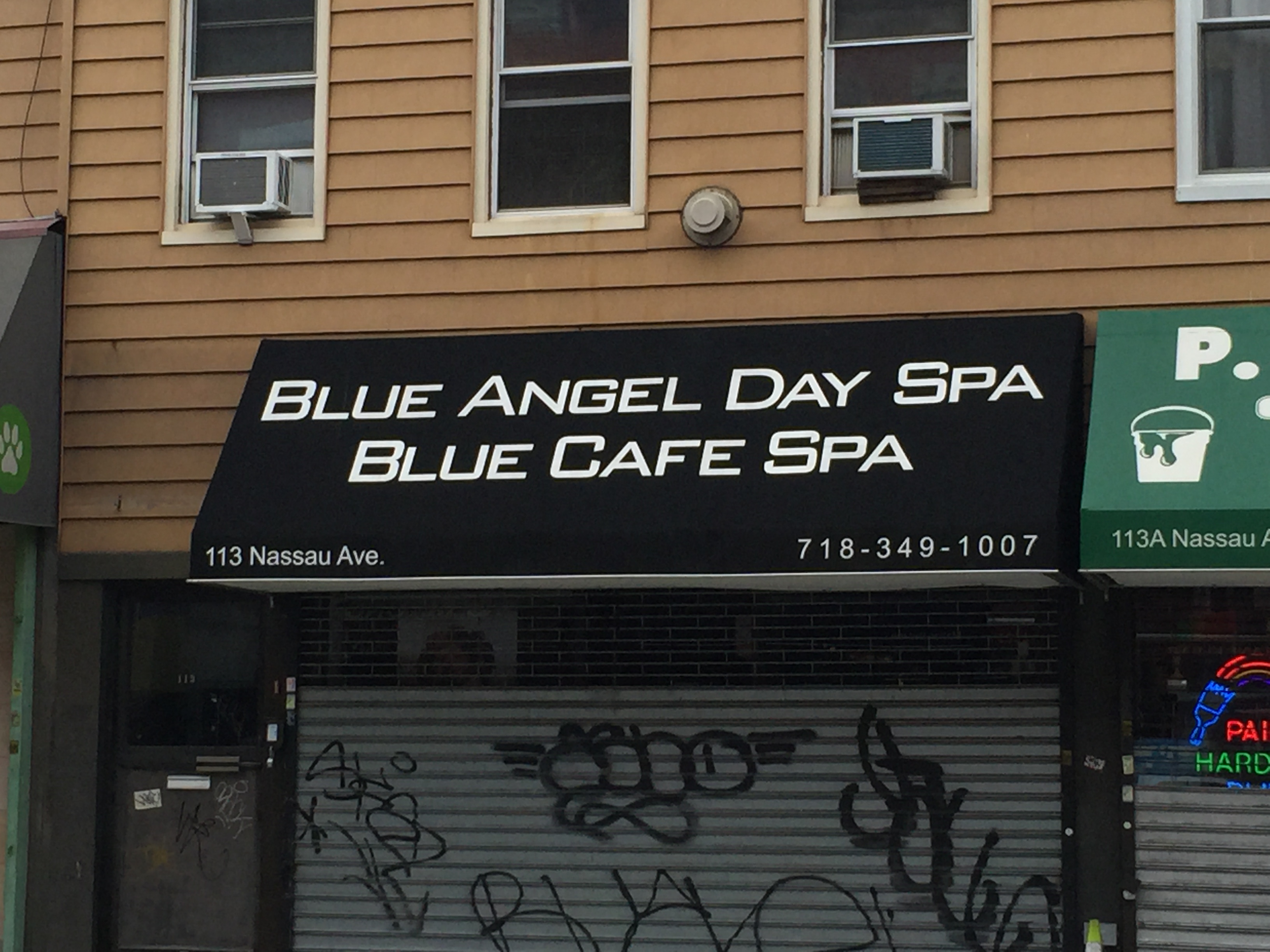
So which spa is it? Do I get a two-for-one deal?
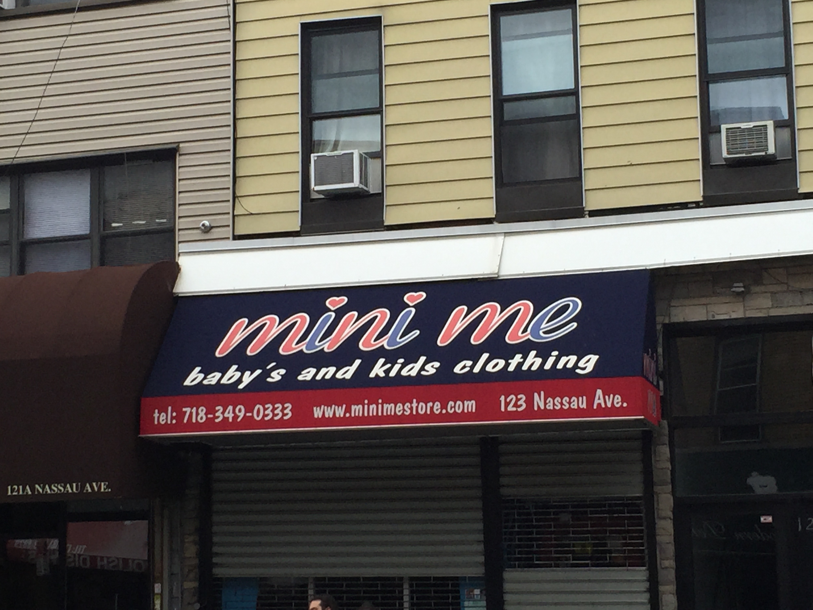
So only shop here if you have one baby, but multiple kids
There are, however, some really nice ones as well, such as this hand-painted lettering at Greenpoint Tattoos:

Originally I was going to write about and alter one of the above signs, but then the funniest thing happened. I was at Penn Station, returning from a family dinner in New Jersey. I’d already managed to get lost looking for my outbound train (and then read the slate article about the terrible signage in Penn Station during the ride and lol’d to myself quietly).
When I was coming back into the city, I realized I would finally have to deal with one of those things I’ve dreaded since moving to New York – weekend rail service changes. I go to swipe my card at the uptown E track, but there’s a sign that says the train isn’t running there. It’s running on the express line. Um. Ok. Would be helpful if you told me which line is the express line. But I figure out it’s the A, so I go to that track and I see this sign:
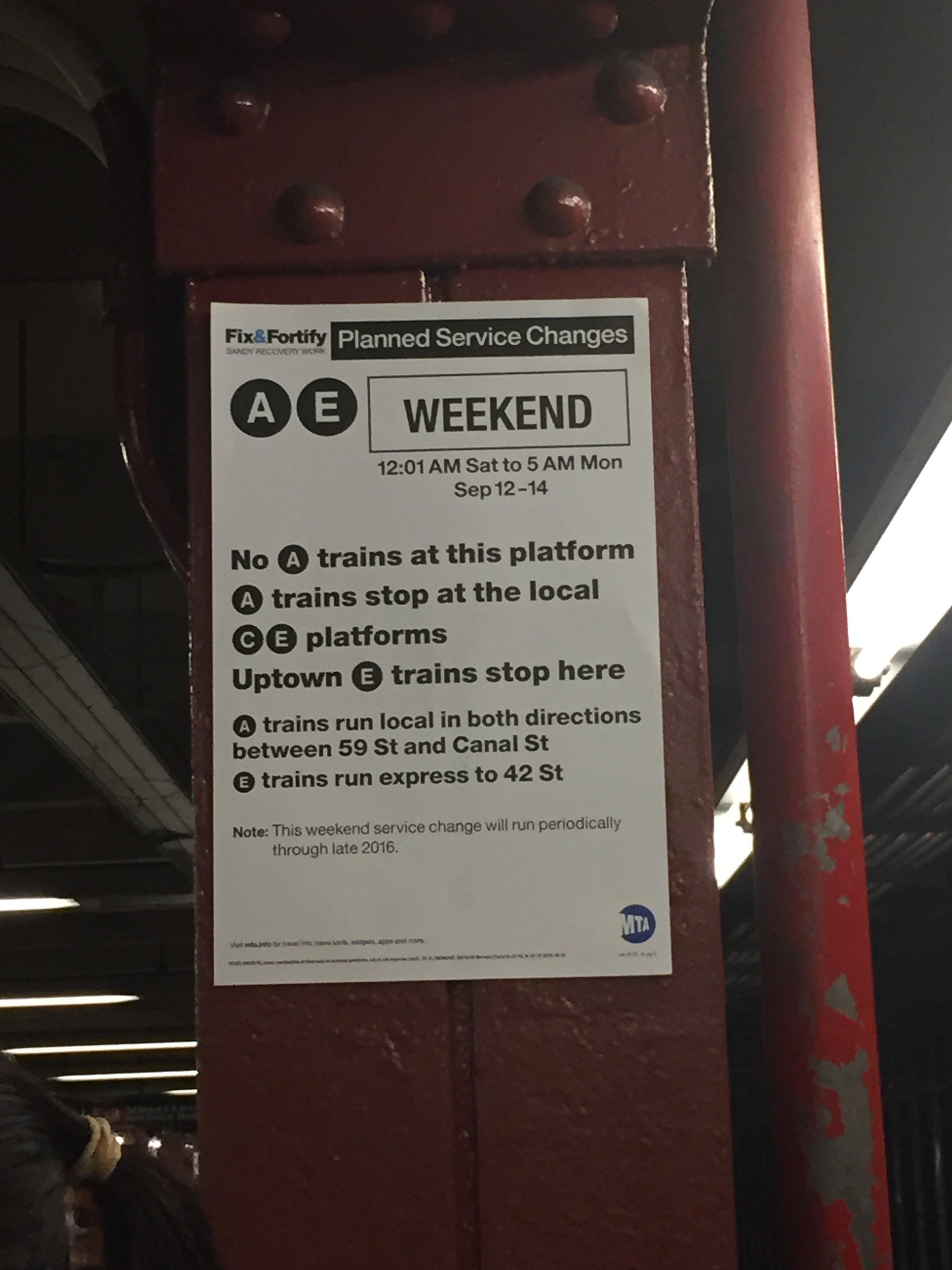
Great! This sign tells me I’m in the right place. I’m going to get home alright. But lawd, is it not a terribly written, wordy confusing sign. So I snap a picture of it in good fun (and to post here) and continue waiting for the train.
That’s when I notice that everyone on the platform starts sprinting for the stairs…because the E train has pulled up to another platform. ZOINKS! Gotcha! Damn, MTA. What’s the point of making a sign that says where a train is going to stop if its not going to stop there? And then do that TWO times over? oof.
Luckily, I caught the train. And had proof of another terrible sign.
Heres the improved sign:
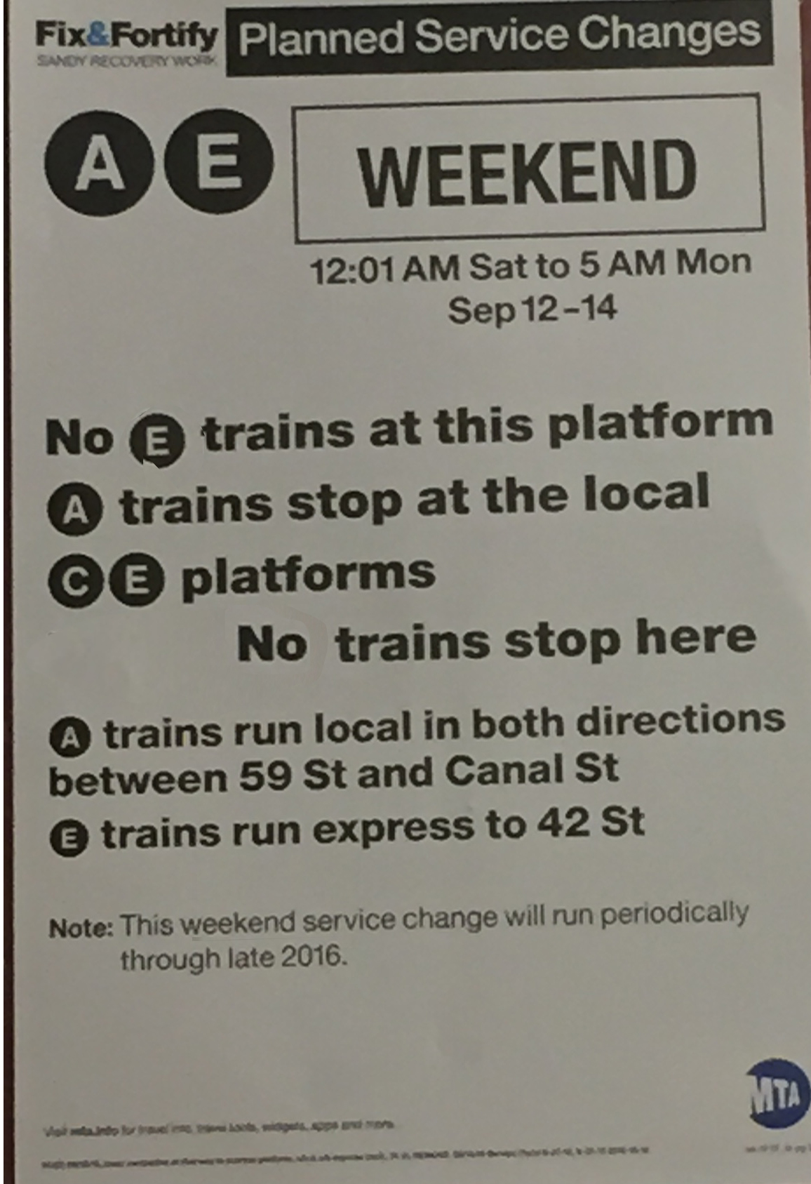
I think it does a better job of telling you where you need to be, or at least, where you DON’T need to be…
Sound and Vid, Wk 1: Sound Scavenging Results
3 sounds from our scavenger hunt, go!
Someone Laughing
Ambulance and Foul Language
Someone Playing the Drums
😉
Sound and Vid, Wk 1: Sound Walk Response
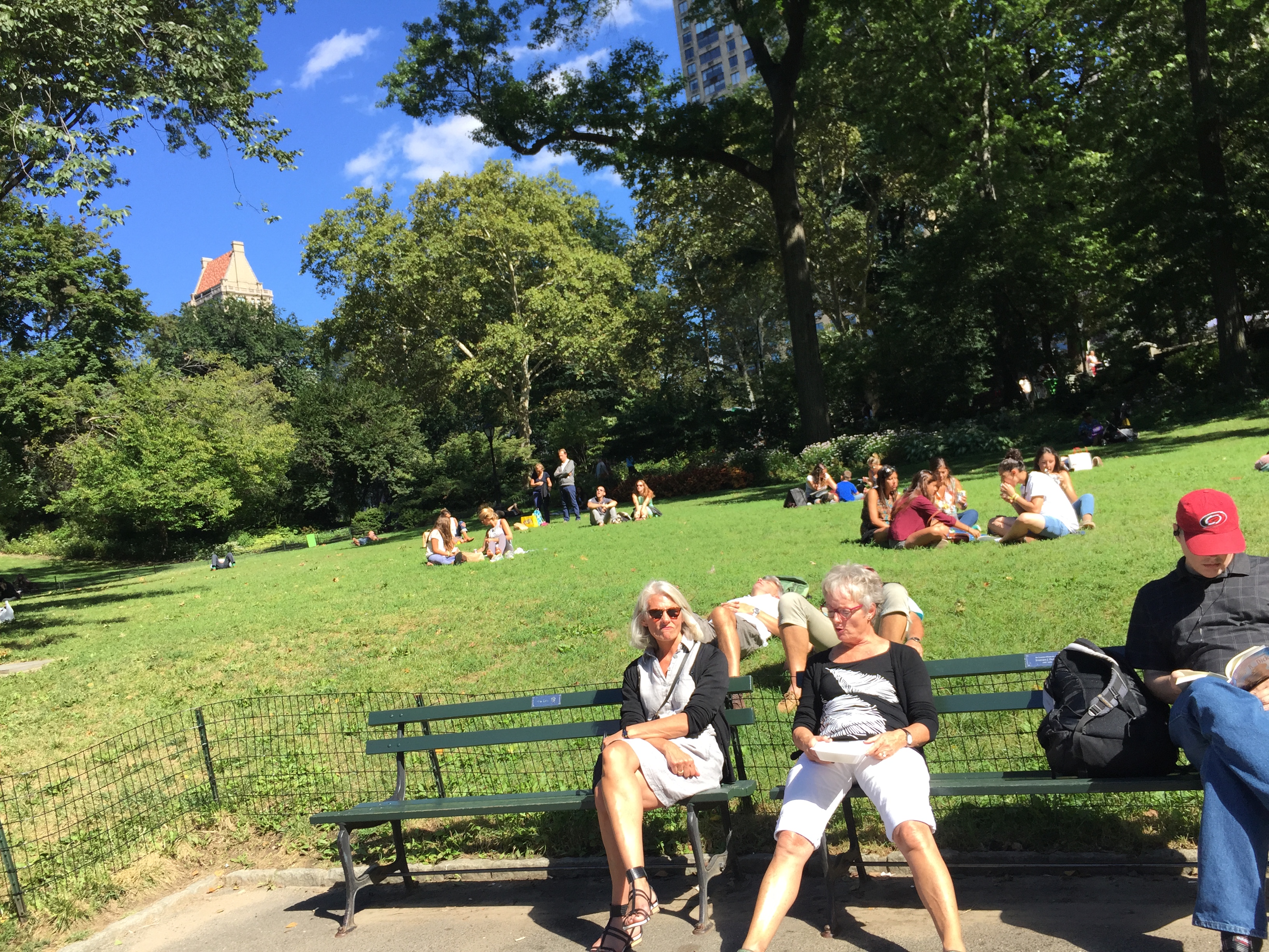
I went on Janet Cardiff’s Central Park soundwalk this afternoon. It was absolutely beautiful out – sunny, 70 degrees, with a slight breeze. I sat down on a bench underneath the Josi Martin statue and pressed play.
First thing I realized, I couldn’t open the zip file on my phone. Not sure why, but I hadn’t thought that part through beforehand. So obviously a key component of the walk was missing right from the beginning. I will say, however, that Cardiff’s narration allowed me to imagine what I couldn’t see, allowing me to construct an imagined visual layer overtop of the scene in front of me. I found this task especially challenging as she was describing the park in winter, trying to imagine these lush late-summer trees as denuded, cold and lifeless.
I think this play with cognitive dissonance was what I found most compelling about the piece. She describes the park in a state that it isn’t currently in. It’s interesting how suddenly the time of her narrative would change from day to night, asking you to simultaneously be aware of your current place in time and space while superimposing these other details. Or how she points out features or people she passes that aren’t there, though I found myself searching for them all the same. Several times I pulled out my headphones because I couldn’t figure out if the origin of a sound was from the recording or in real life.
What I found even stranger was when things did weirdly match up. The people sunbathing, an asian couple having their wedding photos taken (seriously). You walk in time with the sound of the steps and right where she says there’s a water fountain, there’s a water fountain. It both made sense to see these things (such as architectural elements), but other stuff – specifically people – were a pleasant enhancement, further carrying the narrative.
Perhaps there are certain things that are so consistently New York, and New Yorker activities in Central Park, that they continue to occur despite the year, season, or time of day.
Occasionally, I felt like Cardiff was trying to do a few too many things with the piece. She brings in several different narrative motifs – that of Baudelaire and the slave, as well as Orpheus and Eurydice. At times, I felt these portions to be distracting, pulling attention away from the simple but powerful story of following the path of a series of found photographs rather than enhancing the experience. Another example of this is the experiments, which I enjoyed but also wondered how much they really added to the overall experience. I guess they served some purpose if they stayed with me.
Throughout the walk, I felt like I was insulated from the rest of the park, Cardiff’s voice whispering in my ear. I sort of forgot about everything else, so immersed in this shell of sound. When I’d finished with the narration, I started listening to some music then stopped, pulled out my headphones and tried to pay attention to the sounds that were currently surrounding me. I felt a greater sense of appreciation for the distinct noises and their sources – laughing children, birds in the trees, canoe paddles splashing in the lake. Literally, I felt more in-tune with my surroundings.
PComp, Wk1: What is Interaction?
Prompt: After this class’ discussion and exercise, and reading Chris Crawford’s definition and Bret Victor’s rant, how would you define physical interaction? What makes for good physical interaction? Are there works from others that you would say are good examples of digital technology that are not interactive?
How would I define physical interaction? As much as I would like to posit myself as one of Crawford’s so-called future academics who hold the potential to develop a “high-quality” definition of physical interaction, I went back to graduate school to learn how to make things.
…That being said…with an anthropological background, I find it easy to comprehend Crawford’s metaphor of physical interaction being similar to a conversation (I always loved linguistics classes). However, is conversation the ur-form of interaction? I can’t help but try and make it more basic, to a form of meaningful gesture. I guess, at the end of the day, it is all about communication – whether it takes the form of words, gestures, sounds, etc.
Though –
I can’t help but think of interactions that involve non-human actors exclusively (possibly because I’m working towards ideas of post-humanism?). Would we classify the process that occurs between plants and the sun (photosynthesis) as interaction?
I guess this gets at the crux of Crawford’s example, which is his positing of consciousness as a key component. The “thinking” step, so to speak, of his process. But in that case, what constitutes “thinking” for a computer? It seems to be, from his examples, following a set of (human-coded) instructions. Does rule-following constitute consciousness, thus thinking, on the part of a computer? If we were to place the same restrictions on a human, we would argue that they’re blind rule-following behavior was quite the example of non-thoughtful action. Just sayin’.
[Aside: Recently watched the Hannah Arendt biopic and she theorized blind rule-following behavior as a root of evil. So. There’s that.]I did like Victor’s concept of human capabilities being at the center of computer interaction. In particular, I liked his start at an investigation into making use of our tactile abilities as a way to re-think interfaces beyond the swipe. I became very interested by the possibilities of creating more human-centered design and expanding the capabilities of interface based on the capabilities of the human body – WHICH IS AMAZING! The human body, that is. I mean, we’ve augmented our abilities for ages- from shoes, to eyeglasses, to that guy at MIT (interview on invisibilia) who wore a portable computer as assistive technology. These innovations depend on the human. As we discussed last week, physical computing is not about robots AKA automata AKA those things that operate without human interaction. Physical computing is all about the human interaction.
Daniel Horowitz for NPR
So, in that case, what makes good for good physical interaction? I suppose it is one that best mimics human interaction. One that surprises us with the so-called human-ness of the computer’s reaction, that it forces us to into an interaction.
One example of a recent successful and surprising human interaction is Apple’s Siri software. Just a few months ago, the internet exploded when someone asked the simple question, “Siri, what’s zero divided by zero?”
What pathos.
(Cue Crawford: “We can grasp at emotional differences computers could never comprehend.”)
My friend Amy has recently taken to posting her own philosophical conversations with Siri. A few follow below:
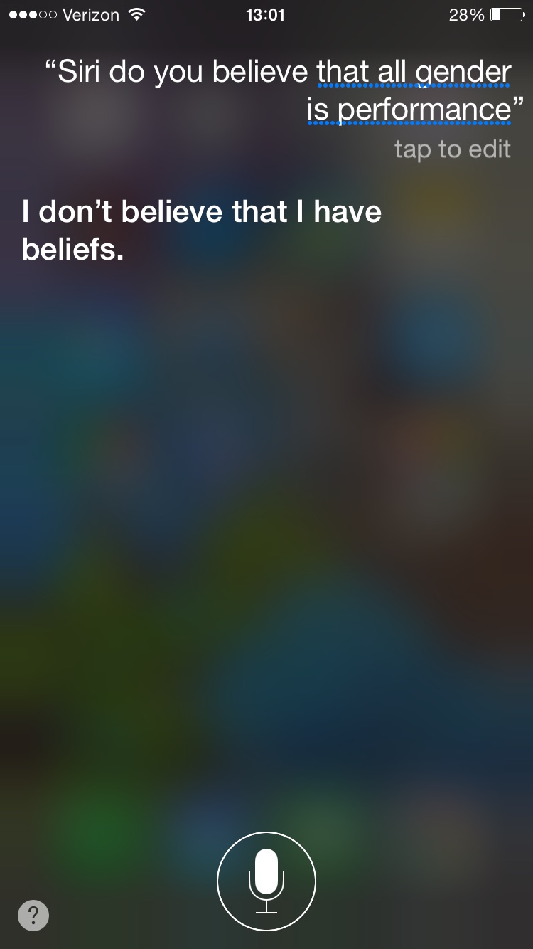
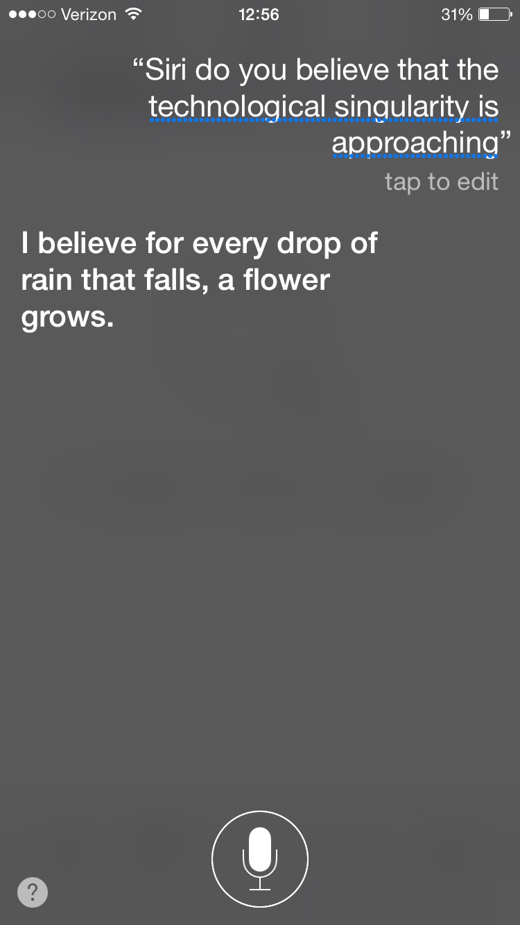
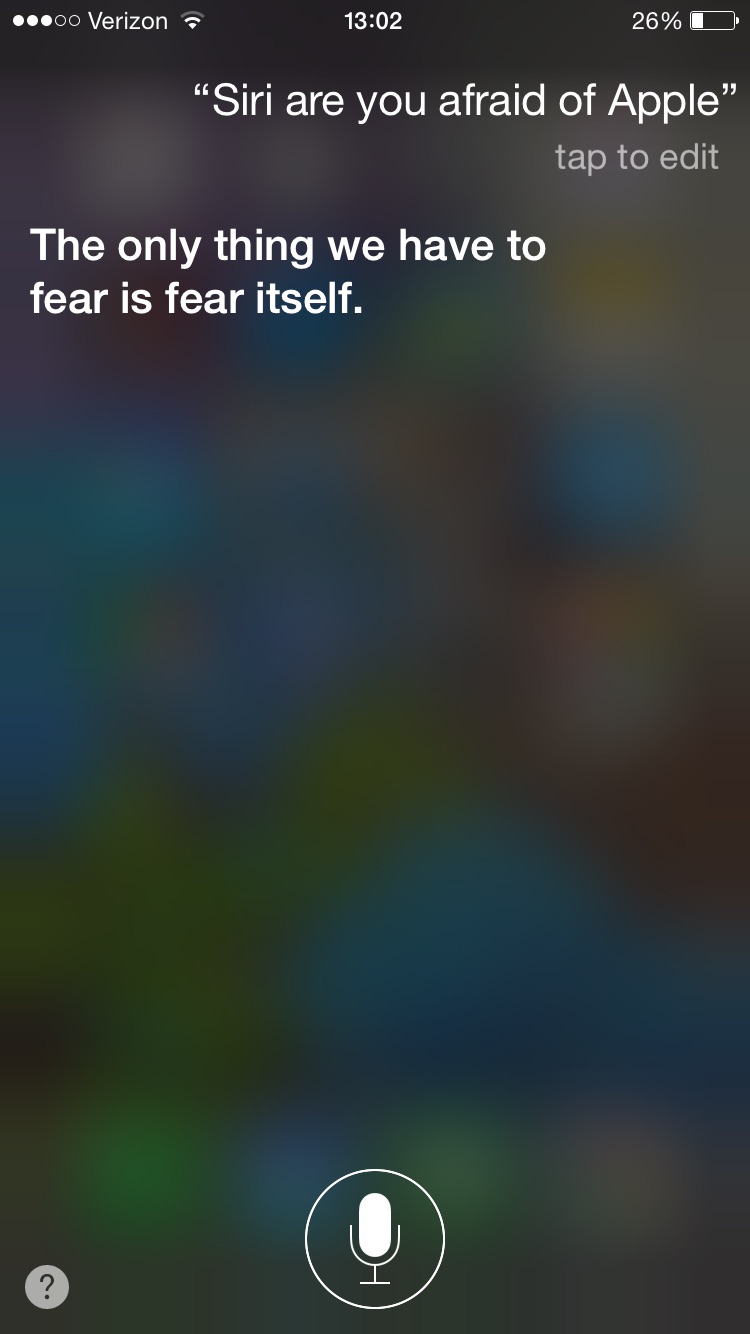
Like Crawford said, people identify with interaction because of the emotion behind it. Simply by Siri saying she “believes,” she’s relating a type of emotion. Gotta love her belief that she doesn’t have any beliefs. What else could be more human?
As for good examples of digital technology that are not interactive, I can’t help but immediately think of the projection collective in Baltimore that I was a part of before coming to ITP.

We created large-scale, outdoor projections using a variety of media, but more often than not didn’t have an interactive component. If we did have an aspect that could be defined as interactive, it was usually the in-person conversations that would take place at the site of the projection.
In closing, I think that physical computing proposes a lot of interesting philosophicalish conversations about the nature of consciousness/processing and what it means exactly to interact with a non-conscious object. I llok forward to dreaming up new types of interfaces that make use of our full range of physical capabilities, beyond the swiping and pinching. Oh, and asking Siri more ontological questions.
PS: Also, I do find it funny that as much as Crawford mentions the inabiity for a book to be interactive, he tries to make it so. I found that several of my questions were anticipated and answered a few paragraphs later, and the review questions were particularly engaging. Funny stuff.
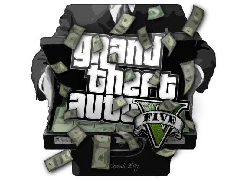
PPS: As proof of Crawford’s market analysis that interaction is the most successful product- just found out this weekend that GTA5 is the largest grossing media of all time. BILLIONS in the first day.
ICM, Wk 1: Oh hi, p5.js
So here we are, the start of the semester. The start of GRADUATE SCHOOL. Holy sh*t. Five years out and I’m finally back in. The teacher becomes the student once again.
One of the classes I’ve been most excited to take is ICM (Intro to Computational Media, for all those non-ITPers). It was my understanding/expectation that this was the programming class, but not just regular programming – artistic, creative, experimental programming! Because ITP is a mix of all those things. I heard we got into Processing, which I learned a bit of in a coursera class about a year ago (never finished, but made a few sweet small illustrations).
Due to some social sleuthing, I found out from a resident that we were switching to a NEW program this year – this so-called p5.js. “New new, blah blah, things are probably going to be nuts so you should check it out beforehand.” So I took his advice and watched a funny video that featured Lauren and Shiffman (before I really knew who they were). I particularly liked the part where Shiffman said “See you later!” and then I found out that he taught at ITP and saw him at Orientation…a couple of days later.
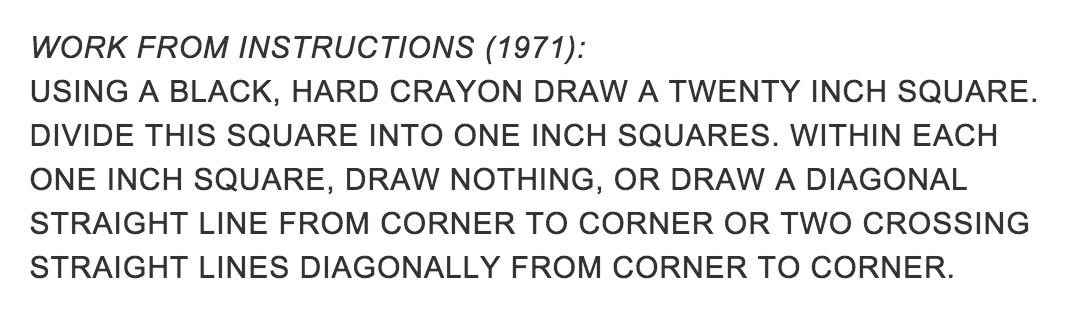
So, ICM was the first class I had. I really enjoyed the exercise we did – creating instructions for a drawing and making a drawing from someone else’s set of instructions. The exercise reminded me of that old conceptual art boss, Sol LeWitt.
For those who are unfamiliar, Sol Le Witt was a conceptual artist from the 1970s who had a series known as the Wall Drawings. The idea behind the wall drawings was that LeWitt would write up a set of instructions and give them to people to execute as large drawings on a wall surface. Some were very specific, others left room to interpretation.
So when we got the assignment, I immediately thought of LeWitt. I also thought, wouldn’t it be funny to try and process a set of LeWitt wall drawing instructions into p5? Almost like a game of artistic telephone. I interpret LeWitt’s instructions and then turn them into code AKA a set of instructions for the computer to then interpret.
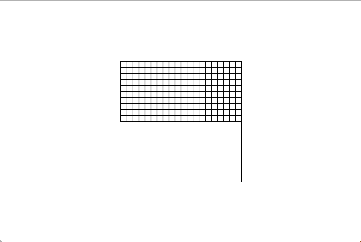
So I grabbed Instructions (1971)

Which a version of at the MoMA is interpreted like this:
I was easily able to make a rectangle, and rectangles inside of it. But when it came to plotting lines, I quickly became frustratingly inept at getting it to place them where I thought they should go. My brain could not for the life intuit/understand this grid system. this led to grumblings and comparisons of analogue vs digital, a WHY CAN’T I JUST DRAW IT MYSELF. I turned to classmate Paula and using some basic math and trial and error, we figured out how to get my line where it needed to go.

I then looked back at the instructions and realized I mis-interpreted some of them, so went back to the drawing board (heh heh).
First I started by creating a 200x200px square (to correspond to the 20’x20′ square) on a 400x600px canvas.

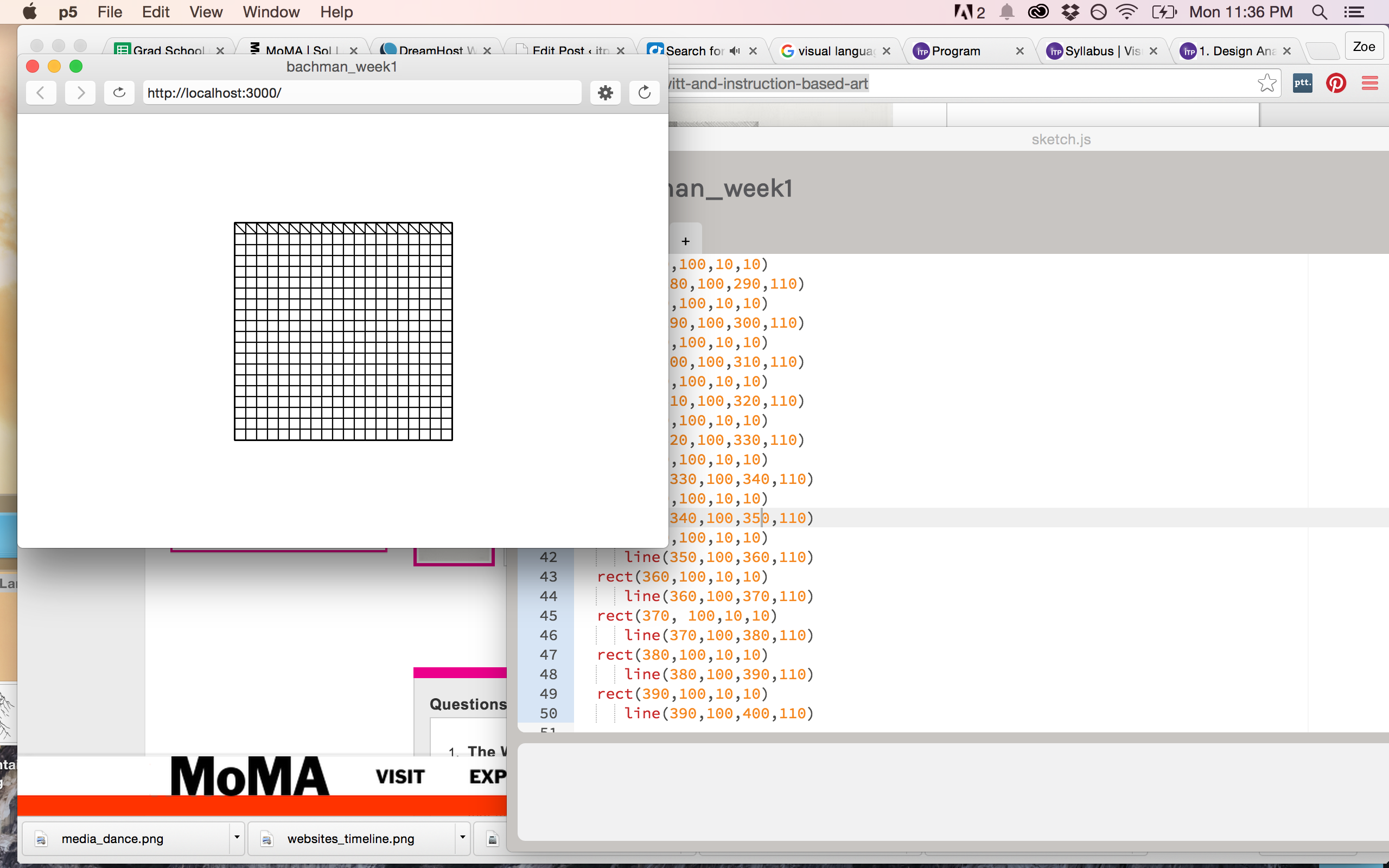
Then, in order to preserve the ratio in the instructions, I made squares 10x10px inside of the larger 200x200px square. 200 individual lines of coded squares. Let’s just say copy and paste saved me. First I created the entire first row, copy and pasted that for my second row, then figured out which parts I needed to modify. I continued that for the next 10 rows.
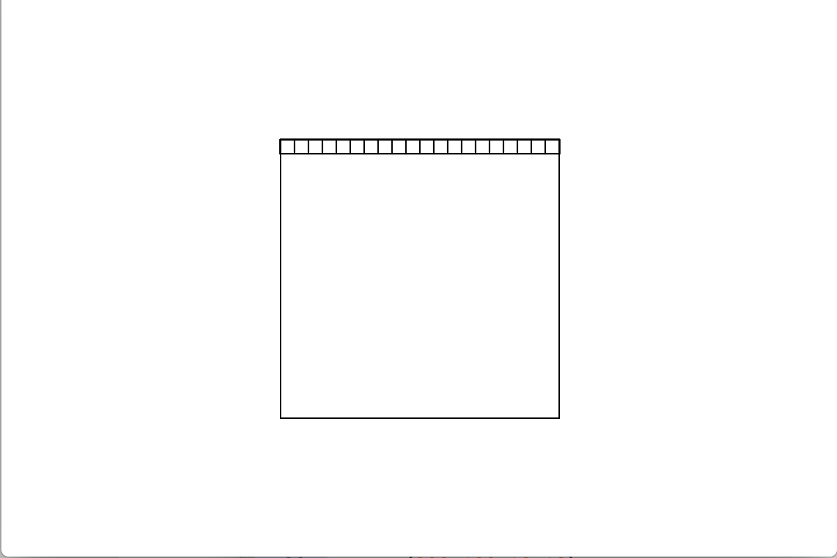
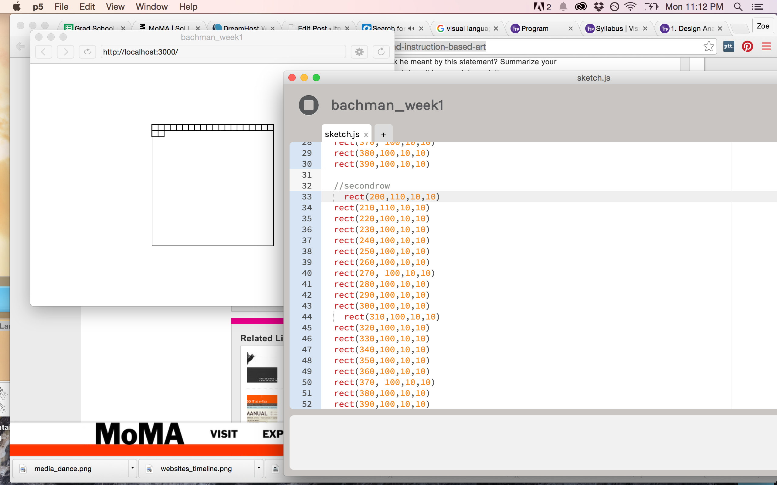
I then copied the code for the first half of squares and pasted it to create the next 10 rows, for a total of 20.

Next, I followed the next set of instructions and decided where to put my diagonal lines. Since all the rectangles have coordinates, I tried to match them up to create lines in a few of the boxes.
Now, this is where I started to struggle. Was I really going to write out each line of code for each line? I mean, sometimes I wanted two lines in each square aaaand that could mean up to 400 lines of…lines >< So I tried to organize my code to better copy and paste, but this was pretty difficult at times because I didn't have a chunk of code like I did when i made the squares. So, I divided the square in half along the diagonal, and decided to the left I would have diagonal lines going from bottom to top and to the right I would have them go top to bottom.
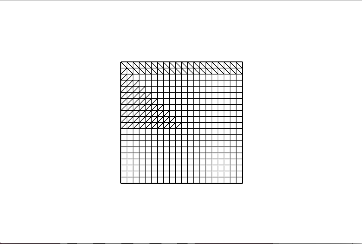
At some point I decided I’d have intersecting lines as the main diagonal line that bisects the large square.
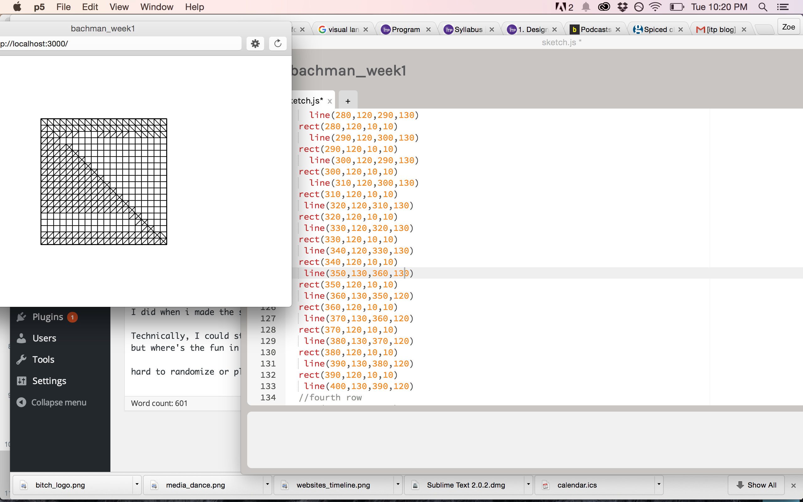
Then at another point, I decided I wanted more intersecting lines than just that, so started to add lines of code to some of the bottom rows.
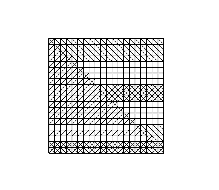
Initially, I didn’t want to use any blank squares. But as I proceeded in a somewhat randomized fashioned, I noticed that I liked some of the white areas I had left unintentionally. In general, it was difficult to be spontaneous with this and while LeWitt’s instructions leave an openness to randomization, my artistic-minded self wanted more of an intentional composition.
This artist-minded self proved difficult when my brain started getting tired and I would copy and paste the wrong code and have to redo it all. I mean, because it didn’t fit my intended composition. (I wonder what it would have looked like had I left my mistaken code…?)
What I found most interesting about such an iterative process was how meditative it became, and that I got into that same zone I do when I’m drawing. Although, this was after a few times when I just wanted to gouge my eyes out form starting at all these line and rectangle codes and the palms of my hands got sweaty from continually touching my laptop.
In the end, while I originally anticipated filling in every square, I liked the emerging composition that included the blank spaces (cue TSwift), giving it a weaving effect. So, I decided to stop there.
All in all, I find the concept of riffing off of other’s work very interesting. You can expand or subvert the very intentions of an artist by using their work in a new way or putting it in a new context. It also gives a specific context to a new piece, situating the new work in a certain language and history.
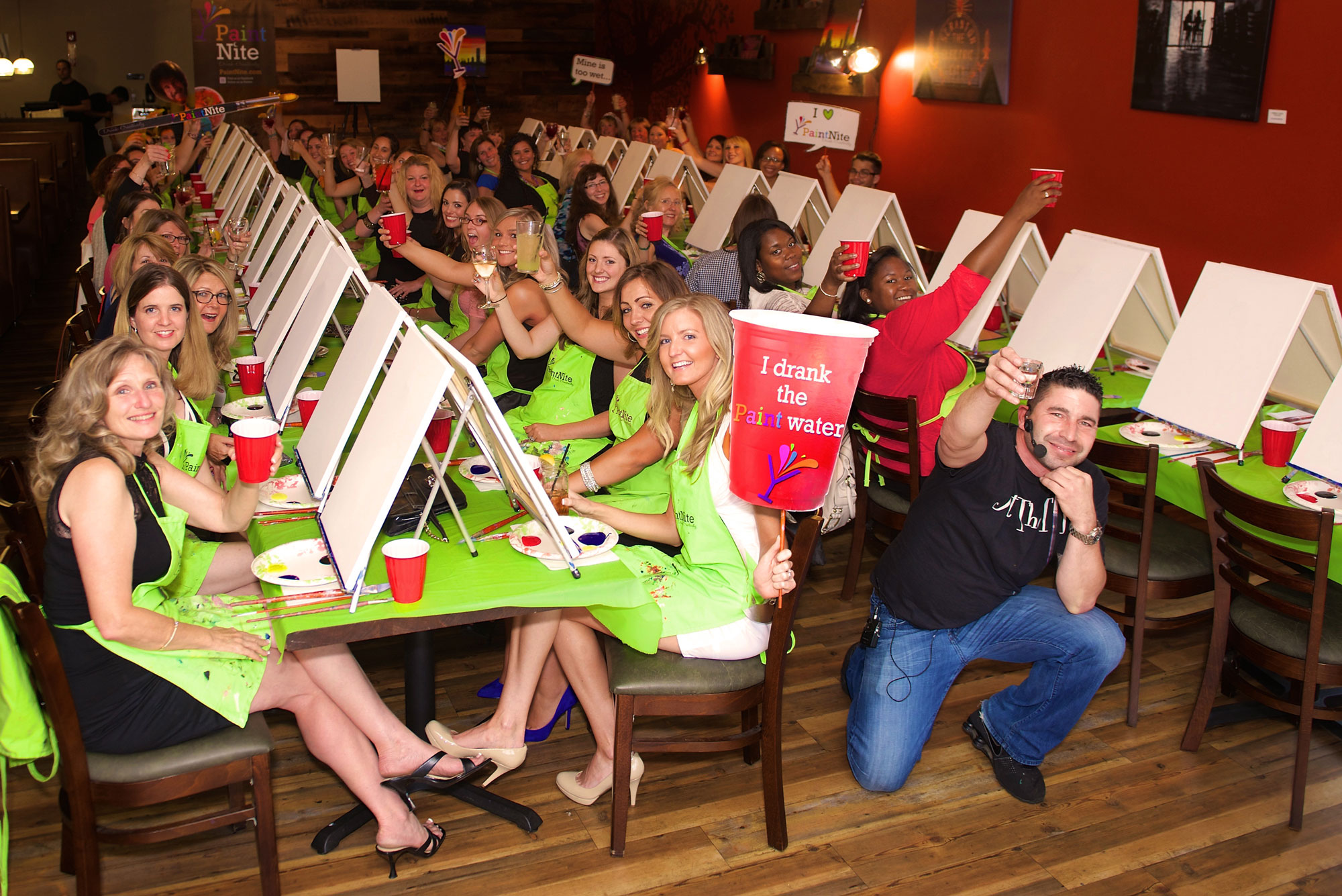
I’m also interested in the idea of instructional-based art and the nuances and interpretations that can occur, even when someone tries to stick closely to the model. Makes me think of happy-trees painter, Bob Ross and his show, The Joy of Painting on PBS or the kids version that I used to watch as a kid, Pappyland. Ditto paint-by-numbers or that new phenomenon, Paint Nite.
Like I said before, it’s sort of like a visual game of Telephone. But I wonder how often that’s due to human error and that if using machine-based drawing systems for a Paint Nite would lead to everyone’s painting’s looking exactly the same, or if the organizers would intentionally leave opportunities for conditional statements.
PS – The New Inquiry’s latest issue on Counterfeit informed and expanded some of these thoughts.
PPS – Here is a song by the Beatle-ette’s, a rip-off/riff on the Beatles that I think treads an interesting line that sort-of also speaks to these ideas.
Vis Lang, Wk 1 Assignment: Design Analysis
While I was trying to think of what piece to analyze for my assignment this week, I happened to click on the Bitch Media website and…they’d re-designed it. Seems to be something a few of my favorite lady sites have gone through the past couple months – Hairpin and Rookie also recently did re-designs.
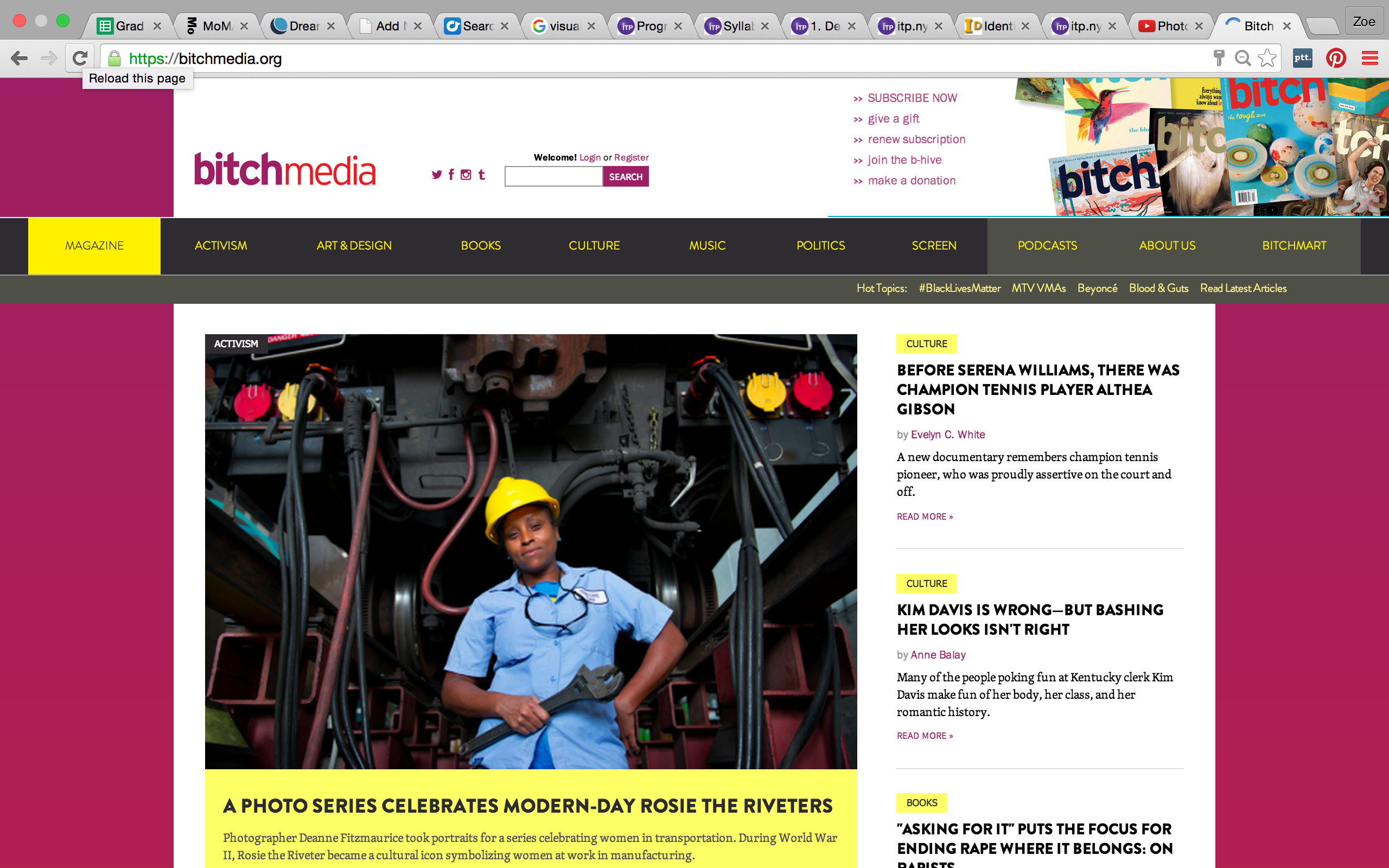
The brand-spankin-new website
So, I thought – why not analyze that?
Obviously, there’s a reason as to why the Bitch Media team decided to redesigned the site. As we talked about in class, design is a form of organization and a means of realizing the ideal version of an object, or in this case, a website. Bitch Media’s website has gone through several iterations since it first appeared on the web in 1998.
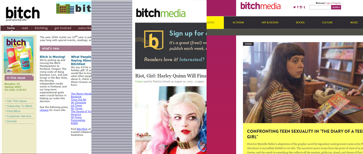
Originally conceived of as simply an online companion to it’s more well-known print publication, Bitch Magazine, Bitch Media’s website has evolved in its own right into a central source for feminist writing and debate. As more people become introduced to their content through its online presence, it’s important that the website should be as accessible as their print publication.
In the words of Bitch Media’s Art Director, Kristin Rodgers Brown:
“Someone recently told me that the thing they love about the design of Bitch magazine is that it makes complex content easy to digest and fun to read. All through this site redesign—as we were grappling with never-ending questions about structure, design, and function—I had that comment running through my head. The result? We made it simple and FUN to look around the site.”(1)
So how does the redesign maximize readability and content organization?
Let’s take a look at the different visual aspects of the new website:
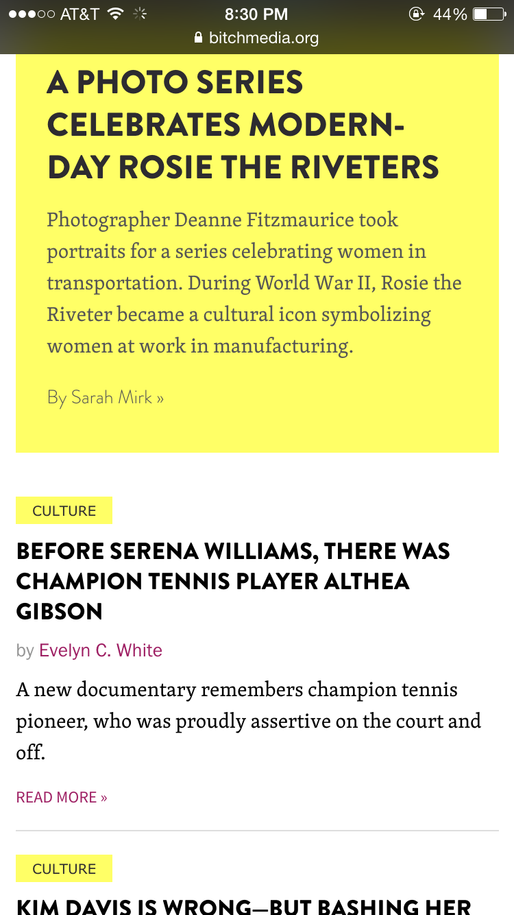
Underlying System
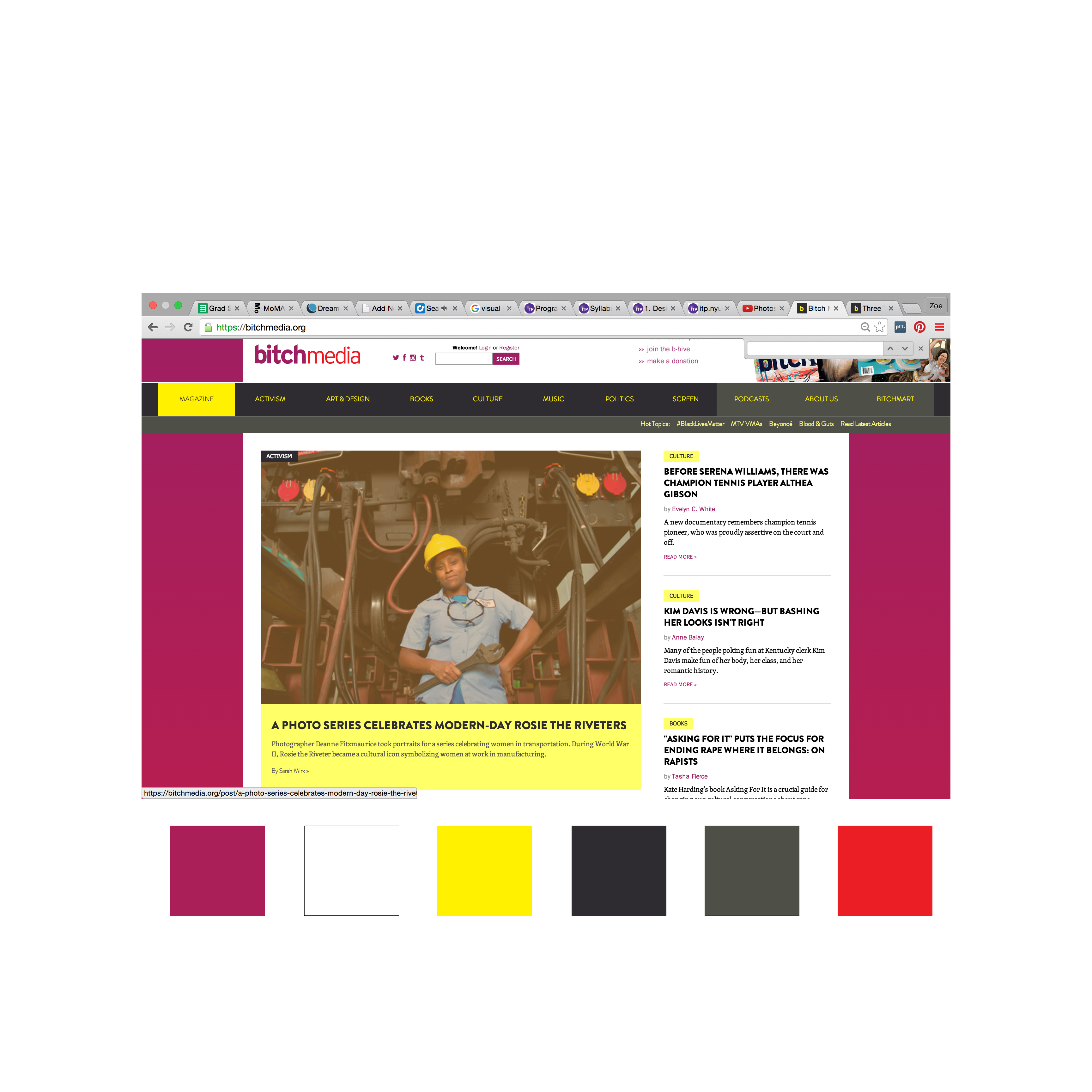
The website uses somewhat of a grid system, organize around a central bisecting line, while creating smaller columns to the left and right. It uses clever breaks in the grid lines to bring your eye to important information, such as the main story. There’s a large amount of negative space on either side of the content, making it easy for your eyes to focus on the meat of the website.
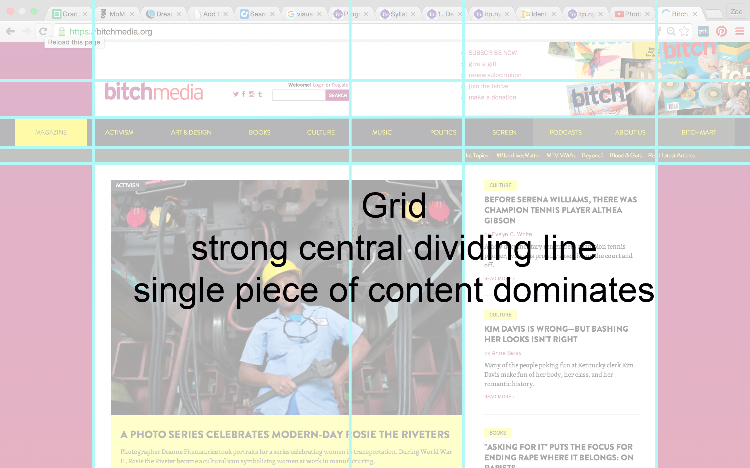
In terms of hierarchy, the way my eye moves across the page (and I’ll be honest, I’m not entirely sure how correct this is, but this was my gut reaction) it goes from:
– Main header across top, which includes the logo, social media platforms, and a list of ways to get involved. Those bright colors in the Bitch Media logo pop!
– Secondary header includes topics that are used to organize content, a small sub-header includes trending “Hot Topics”
– Then the eye drops down to the large main story in the body of the page, which takes up most of the top-fold of the site
– Moves across to the side bar with other stories and content. This also lines up with the #hottopics sub-header.
(FYI: The site uses the over-the-fold technique – have to scroll to see more content. But I’m just focusing on what you see when you first load the page.)

Typography
From what I could identify using What the Font? and identifying the source code, it looks like the following are the fonts used in the website:
brandon-grotesque – That’s the black, bold font they use for headlines
skolar – Looks like this is the yellow font used in the topics and links
Georgia – For the written content
(there’s some other fonts listed in the source code, but my assumption was that the ones that are listed after the first are what the website defaults to if the page doesn’t load the intended one…si?)
Color Palette
Bright, warm, saturated colors – magenta, white, yellow, black/dark grey, light grey, red
Anaylsis
To return to the words of the Art Director, is the site simple and fun? Does it make everything readable?
In terms of simplicity, sure – you see content right away. The big chunk of space that the main story takes up immediately tells you what is most interesting and important. This structural change is in DIRECT contrast to the previous way they organized their site, which was in more of a blog/chronological format, where there was no hierarchy to the posts. Now important articles stay at the top of the page longer and it is easier to distinguish between highly-researched, long-format pieces from daily news responses (relegated to the side bar and below-the-fold) (2).
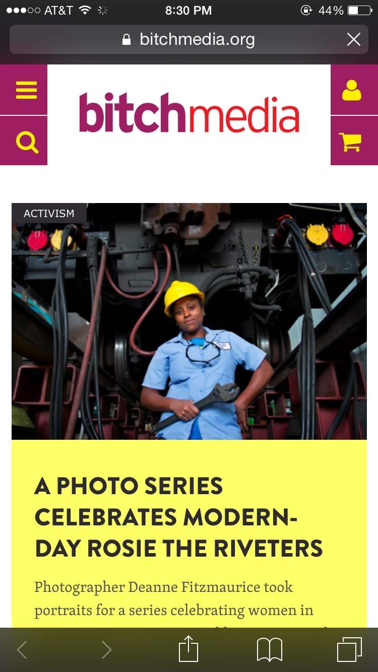
I took a look at the mobile platform as well, since they explicitly wrote that their intention with the redesign was to improve readability across devices. The mobile platform preserves the content hierarchy, hitting you with the logo and immediately the main story, followed by recently posted articles that on the desktop browser are on the side. Again, that focus on immediately showing you the most important content.
As a reader, I find it interesting that they now prioritize certain content over others and wonder, what system do they use to choose their main story? Why are certain stories considered “more important”? Will other articles that don’t fit that criteria simply get overlooked?
I do think highlighting content topics at the top of the page brings increased accessibility to the content, particularly the “Hot Topics” sub-header. It makes me as a reader immediately want to delve into subjects that I’m interested in and explore those I’d want to know more about. I think it does more to encourage the reading of particular articles, ones that I may have skipped past in the previous website if they hadn’t been visually recommended.
I also want to point out that they have increased the visibility of ways to get involved, by placing links in the header directly across from the logo. This design choice makes it more obvious for readers to engage with the Bitch Media community. As a media company that prides itself on community involvement and depends on submissions and donations, I think its a good step to visually prioritize audience engagement.
Is it fun? The colors are playful – bright, candy-like. The fonts have an edginess, boldness, and being in all-caps of the headlines lends a certain forcefulness to the words. This is not a flowery, simpering, weak website. As a comparison, the website Rookie, who also recently did a redesign, uses youthful visual tropes of hand-writing and doodles, which gives it a whimsical, high-school youth effect. Bitch Media’s website feels like the stronger, more-experienced older sister. One that doesn’t have time for frou-frou backgrounds and manages to keep its content clear and concise while still being bright, young, and punchy.
Overall, the website’s redesign has improved its accessibility to radical, informative content while maintaining a bold, dynamic aesthetic. As a reader, you immediately know the most important piece of content while also having easy access to other articles and topics, as well as easy ways to get involved in the company. The bright colors and edgy fonts (in all caps) engage the eye while keeping things playful, yet strong. In comparison to the previous iteration of the website, I think the Bitch Media team has done a successful job in better organizing and improving upon the way they deliver content and engage their audience. Brava, ladies.
Notes:
1.https://bitchmedia.org/article/three-things-i-love-about-our-new-website-design
2.https://bitchmedia.org/article/introducing-new-bitchmediaorg